KPI Dashboard, Excel and Metrics PPT Templates
-
 Inventory kpi for average age supply months ppt slide
Presenting inventory kpi for average age supply months ppt slide. This presentation slide shows Two Key Performance Indicators or KPIs. The first KPI that can be show is Average Age of Inventory. The second KPI is Inventory Months of Supply. These KPI Powerpoint graphics are all data driven, and the shape automatically adjusts according to your data. Just right click on the KPI graphic, enter the right value and the shape will adjust automatically. Make a visual impact with our KPI slides.
-
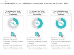 Delay status kpi for unavailability of manpower equipment services ppt slide
Presenting delay status kpi for unavailability of manpower equipment services ppt slide. This presentation slide shows three Key Performance Indicators or KPIs. The first KPI that can be show is percentage of Orders With Delay Status Due to Unavailability of Manpower. The second KPI is percentage of Orders With Delay Status Due to Unavailability of Equipment and the third is percentage of Orders With Delay Status Due to Unavailability of Services. These KPI Powerpoint graphics are all data driven, and the shape automatically adjusts according to your data. Just right click on the KPI graphic, enter the right value and the shape will adjust automatically. Make a visual impact with our KPI slides.
-
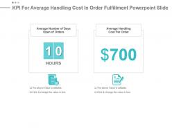 Kpi for average handling cost in order fulfillment powerpoint slide
Presenting kpi for average handling cost in order fulfillment powerpoint slide. This presentation slide shows two Key Performance Indicators or KPIs. The first KPI that can be show is Average Number of Days Open of Orders. The second KPI is Average Handling Cost Per Order. These KPI Powerpoint graphics are all data driven, and the shape automatically adjusts according to your data. Just right click on the KPI graphic, enter the right value and the shape will adjust automatically. Make a visual impact with our KPI slides.
-
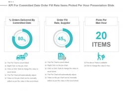 Kpi for committed date order fill rate items picked per hour presentation slide
Presenting kpi for committed date order fill rate items picked per hour presentation slide. This presentation slide shows three Key Performance Indicators or KPIs. The first KPI that can be show is percentage Orders Delivered By Committed Date. The second KPI is Order Fill Rate, Supplier and the third is Picks Per Man Hour. These KPI Powerpoint graphics are all data driven, and the shape automatically adjusts according to your data. Just right click on the KPI graphic, enter the right value and the shape will adjust automatically. Make a visual impact with our KPI slides.
-
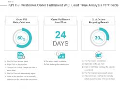 Kpi for customer order fulfilment with lead time analysis ppt slide
Presenting kpi for customer order fulfilment with lead time analysis ppt slide. This presentation slide shows three Key Performance Indicators or KPIs. The first KPI that can be show is Order Fill Rate, Customer. The second KPI is Order Fulfillment Lead Time and the third is percentage of Orders Requiring Rework. These KPI Powerpoint graphics are all data driven, and the shape automatically adjusts according to your data. Just right click on the KPI graphic, enter the right value and the shape will adjust automatically. Make a visual impact with our KPI slides.
-
 Kpi for neglected assigned escalated orders presentation slide
Presenting kpi for neglected assigned escalated orders presentation slide. This presentation slide shows three Key Performance Indicators or KPIs. The first KPI that can be show is percentage of Neglected Orders. The second KPI is percentage of Incorrectly Assigned Orders and the third is percentage of Escalated Orders. These KPI Powerpoint graphics are all data driven, and the shape automatically adjusts according to your data. Just right click on the KPI graphic, enter the right value and the shape will adjust automatically. Make a visual impact with our KPI slides.
-
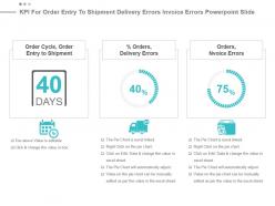 Kpi for order entry to shipment delivery errors invoice errors powerpoint slide
Presenting kpi for order entry to shipment delivery errors invoice errors powerpoint slide. This presentation slide shows three Key Performance Indicators or KPIs. The first KPI that can be show is Order Cycle, Order Entry to Shipment. The second KPI is percentage Orders, Delivery Errors and the third is Orders, Nvoice Errors. These KPI Powerpoint graphics are all data driven, and the shape automatically adjusts according to your data. Just right click on the KPI graphic, enter the right value and the shape will adjust automatically. Make a visual impact with our KPI slides.
-
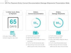 Kpi for payment entry correct documentation damage shipments presentation slide
Presenting kpi for payment entry correct documentation damage shipments presentation slide. This presentation slide shows three Key Performance Indicators or KPIs. The first KPI that can be show is percentage Order Cycle, Entry to Payment. The second KPI is Orders, Correct Documentation and the third is Orders, Damage Shipments. These KPI Powerpoint graphics are all data driven, and the shape automatically adjusts according to your data. Just right click on the KPI graphic, enter the right value and the shape will adjust automatically. Make a visual impact with our KPI slides.
-
 Kpis for total neglected orders with mean time duration powerpoint slide
Presenting kpis for total neglected orders with mean time duration powerpoint slide. This presentation slide shows two Key Performance Indicators or KPIs. The first KPI that can be show is percentage of Re Opened Orders . The second KPI is Mean Duration to Fulfill Service Order. These KPI Powerpoint graphics are all data driven, and the shape automatically adjusts according to your data. Just right click on the KPI graphic, enter the right value and the shape will adjust automatically. Make a visual impact with our KPI slides.
-
 Neglected orders kpi for mean time and order cycle ppt slide
Presenting neglected orders kpi for mean time and order cycle ppt slide. This presentation slide shows two Key Performance Indicators or KPIs. The first KPI that can be show is Mean Time Order to Activation. The second KPI is Order Cycle, Order Receipt to Entry. These KPI Powerpoint graphics are all data driven, and the shape automatically adjusts according to your data. Just right click on the KPI graphic, enter the right value and the shape will adjust automatically. Make a visual impact with our KPI slides.
-
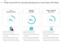 Order cycle kpi for overdue backlog error free orders ppt slide
Presenting order cycle kpi for overdue backlog error free orders ppt slide. This presentation slide shows three Key Performance Indicators or KPIs. The first KPI that can be show is percentage of Overdue Orders. The second KPI is Backlog of Orders and the third is Orders, Receipts Error Free. These KPI Powerpoint graphics are all data driven, and the shape automatically adjusts according to your data. Just right click on the KPI graphic, enter the right value and the shape will adjust automatically. Make a visual impact with our KPI slides.
-
 Order fill rate for delayed orders fulfilment process powerpoint slide
Presenting order fill rate for delayed orders fulfilment process powerpoint slide. This presentation slide shows two Key Performance Indicators or KPIs. The first KPI that can be show is Average Days Late Per Late Order. The second KPI is Fulfillment Process Costs as percentage Opex. These KPI Powerpoint graphics are all data driven, and the shape automatically adjusts according to your data. Just right click on the KPI graphic, enter the right value and the shape will adjust automatically. Make a visual impact with our KPI slides.
-
 Order fulfilment schedule date delay status unavailability of resources presentation slide
Presenting order fulfilment schedule date delay status unavailability of resources presentation slide. This presentation slide shows three Key Performance Indicators or KPIs. The first KPI that can be show is percentage of Orders With Schedule Date Earlier or Equal to Late Finish Date. The second KPI is percentage of Orders With Delay Status and the third is percentage of Orders With Delay Status Due to Unavailability of Resources. These KPI Powerpoint graphics are all data driven, and the shape automatically adjusts according to your data. Just right click on the KPI graphic, enter the right value and the shape will adjust automatically. Make a visual impact with our KPI slides.
-
 Freight cost kpi for undamaged goods on time pickups powerpoint slide
Presenting freight cost kpi for undamaged goods on time pickups powerpoint slide. This presentation slide shows two Key Performance Indicators or KPIs in a Dashboard style design. The first KPI that can be shown is percentage of Undamaged Goods After Shipping Transportation. The second KPI is On time Pickups. These KPI Powerpoint graphics are all data driven, and the shape automatically adjusts according to your data. Just right click on the KPI graphic, enter the right value and the shape will adjust automatically. Make a visual impact with our KPI slides.
-
 Freight cost kpi for unit shipped damaged items pick up ppt slide
Presenting freight cost kpi for unit shipped damaged items pick up ppt slide. This presentation slide shows three Key Performance Indicators or KPIs in a Dashboard style design. The first KPI that can be shown is Freight Cost Per Unit Shipped. The second KPI is percentage of Orders Delivered with Damaged Products Items and the third is on Time Delivery and Pickup Load, Stop and Shipment. These KPI Powerpoint graphics are all data driven, and the shape automatically adjusts according to your data. Just right click on the KPI graphic, enter the right value and the shape will adjust automatically. Make a visual impact with our KPI slides.
-
 Freight kpi for accessorial net shipment sales consignment size presentation slide
Presenting freight kpi for accessorial net shipment sales consignment size presentation slide. This presentation slide shows three Key Performance Indicators or KPIs in a Dashboard style design. The first KPI that can be shown is Accessorials as Percent of Total Freight. The second KPI is Outbound Freight Costs as Percentage of Net Sales and the third is Average Consignment Size. These KPI Powerpoint graphics are all data driven, and the shape automatically adjusts according to your data. Just right click on the KPI graphic, enter the right value and the shape will adjust automatically. Make a visual impact with our KPI slides.
-
 Kpi for cost involved delayed order deliveries transaction time powerpoint slide
Presenting kpi for cost involved delayed order deliveries transaction time powerpoint slide. This presentation slide shows three Key Performance Indicators or KPIs in a Dashboard style design. The first KPI that can be shown is Average Cost Involved with Import or Export Transaction. The second KPI is Number of Deliveries with Past Due Goods Issue Date and the third is Average Time of Import or Export Transaction. These KPI Powerpoint graphics are all data driven, and the shape automatically adjusts according to your data. Just right click on the KPI graphic, enter the right value and the shape will adjust automatically. Make a visual impact with our KPI slides.
-
 Kpi for items equipped with rfid right location items ontime line count presentation slide
Presenting kpi for items equipped with rfid right location items ontime line count presentation slide. This presentation slide shows three Key Performance Indicators or KPIs in a Dashboard style design. The first KPI that can be shown is percentage of Items Equipped with Radio Frequency Identification or RFID. The second KPI is percentage Of Orders Items Arrives at The Right Location and the third is Ontime Line Count. These KPI Powerpoint graphics are all data driven, and the shape automatically adjusts according to your data. Just right click on the KPI graphic, enter the right value and the shape will adjust automatically. Make a visual impact with our KPI slides.
-
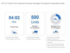 Kpi for transit time shipment quantity damaged throughout presentation slide
Presenting kpi for transit time shipment quantity damaged throughout presentation slide. This presentation slide shows three Key Performance Indicators or KPIs in a Dashboard style design. The first KPI that can be shown is Transit Time. The second KPI is Quantity Per Shipment and the third is Damages as percentage of Throughput. These KPI Powerpoint graphics are all data driven, and the shape automatically adjusts according to your data. Just right click on the KPI graphic, enter the right value and the shape will adjust automatically. Make a visual impact with our KPI slides.
-
 Ontime value kpi for orders damage shipments ppt slide
Presenting ontime value kpi for orders damage shipments ppt slide. This presentation slide shows two Key Performance Indicators or KPIs in a Dashboard style design. The first KPI that can be shown is Orders, Correct Documentation. The second KPI is Orders, Damage Shipments. These KPI Powerpoint graphics are all data driven, and the shape automatically adjusts according to your data. Just right click on the KPI graphic, enter the right value and the shape will adjust automatically. Make a visual impact with our KPI slides.
-
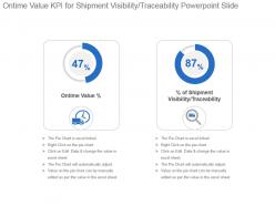 Ontime value kpi for shipment visibility traceability powerpoint slide
Presenting ontime value kpi for shipment visibility traceability powerpoint slide. This presentation slide shows two Key Performance Indicators or KPIs in a Dashboard style design. The first KPI that can be shown is Ontime Value percentage. The second KPI is percentage of Shipment Visibility Traceability. These KPI Powerpoint graphics are all data driven, and the shape automatically adjusts according to your data. Just right click on the KPI graphic, enter the right value and the shape will adjust automatically. Make a visual impact with our KPI slides.
-
 Shipment kpi for bill accuracy outbound transportation costs ppt slide
Presenting shipment kpi for bill accuracy outbound transportation costs ppt slide. This presentation slide shows two Key Performance Indicators or KPIs in a Dashboard style design. The first KPI that can be shown is Freight Bill Accuracy. The second KPI is Outbound Transportation Costs Kilogram. These KPI Powerpoint graphics are all data driven, and the shape automatically adjusts according to your data. Just right click on the KPI graphic, enter the right value and the shape will adjust automatically. Make a visual impact with our KPI slides.
-
 Shipment kpi for transportation cost shipped units lead time ppt slide
Presenting shipment kpi for transportation cost shipped units lead time ppt slide. This presentation slide shows three Key Performance Indicators or KPIs in a Dashboard style design. The first KPI that can be shown is Total Outbound Transportation Cost. The second KPI is Total Number of Outbound Transportation Kilograms and the third is Shipment Lead Time Accuracy. These KPI Powerpoint graphics are all data driven, and the shape automatically adjusts according to your data. Just right click on the KPI graphic, enter the right value and the shape will adjust automatically. Make a visual impact with our KPI slides.
-
 Kpi for inventory replenishment cycle time average unit cost presentation slide
Presenting kpi for inventory replenishment cycle time average unit cost presentation slide. This presentation slide shows two Key Performance Indicators or KPIs in a Dashboard style design. The first KPI that can be shown is Inventory Replenishment Cycle Time. The second KPI is Average Unit Cost. These KPI Powerpoint graphics are all data driven, and the shape automatically adjusts according to your data. Just right click on the KPI graphic, enter the right value and the shape will adjust automatically. Make a visual impact with our KPI slides.
-
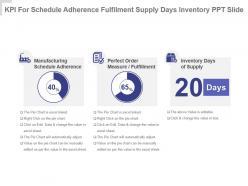 Kpi for schedule adherence fulfilment supply days inventory ppt slide
Presenting kpi for schedule adherence fulfilment supply days inventory ppt slide. This presentation slide shows three Key Performance Indicators or KPIs in a Dashboard style design. The first KPI that can be shown is Manufacturing Schedule Adherence. The second KPI is Perfect Order Measure Fulfillment and the third is Inventory Days Of Supply. These KPI Powerpoint graphics are all data driven, and the shape automatically adjusts according to your data. Just right click on the KPI graphic, enter the right value and the shape will adjust automatically. Make a visual impact with our KPI slides.
-
 Logistics kpi for scrap value inventory accuracy powerpoint slide
Presenting logistics kpi for scrap value inventory accuracy powerpoint slide. This presentation slide shows two Key Performance Indicators or KPIs in a Dashboard style design. The first KPI that can be shown is Scrap Value percentage. The second KPI is Inventory Accuracy. These KPI Powerpoint graphics are all data driven, and the shape automatically adjusts according to your data. Just right click on the KPI graphic, enter the right value and the shape will adjust automatically. Make a visual impact with our KPI slides.
-
 Manufacturing cycle time inaccurate business forecast kpi ppt slide
Presenting manufacturing cycle time inaccurate business forecast kpi ppt slide. This presentation slide shows two Key Performance Indicators or KPIs in a Dashboard style design. The first KPI that can be shown is Manufacturing Cycle Time. The second KPI is Number of Inaccurate Business Forecast Inputs Provided. These KPI Powerpoint graphics are all data driven, and the shape automatically adjusts according to your data. Just right click on the KPI graphic, enter the right value and the shape will adjust automatically. Make a visual impact with our KPI slides.
-
 Percentage value for incorrect orders de ppt slide
Presenting percentage value for incorrect orders de ppt slide. This presentation slide shows two Key Performance Indicators or KPIs in a Dashboard style design. The first KPI that can be shown is percentage of Orders That Were Captured With Incorrect Attributes. The second KPI is percentage of Orders That Were Delivered With Requested Documentation. These KPI Powerpoint graphics are all data driven, and the shape automatically adjusts according to your data. Just right click on the KPI graphic, enter the right value and the shape will adjust automatically. Make a visual impact with our KPI slides.
-
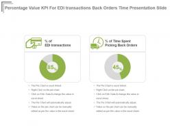 Percentage value kpi for edi transactions back orders time presentation slide
Presenting percentage value kpi for edi transactions back orders time presentation slide. This presentation slide shows two Key Performance Indicators or KPIs in a Dashboard style design. The first KPI that can be shown is percentage of EDI transactions. The second KPI is percentage of Time Spent Picking Back Orders. These KPI Powerpoint graphics are all data driven, and the shape automatically adjusts according to your data. Just right click on the KPI graphic, enter the right value and the shape will adjust automatically. Make a visual impact with our KPI slides.
-
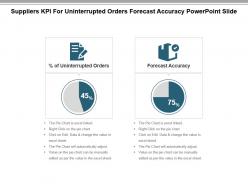 Suppliers kpi for uninterrupted orders forecast accuracy powerpoint slide
Presenting suppliers kpi for uninterrupted orders forecast accuracy powerpoint slide. This presentation slide shows two Key Performance Indicators or KPIs in a Dashboard style design. The first KPI that can be shown is Percentage of Uninterrupted Orders. The second KPI is Forecast Accuracy. These KPI Powerpoint graphics are all data driven, and the shape automatically adjusts according to your data. Just right click on the KPI graphic, enter the right value and the shape will adjust automatically. Make a visual impact with our KPI slides.
-
 Inventory kpi for location accuracy supply days powerpoint slide
Presenting inventory kpi for location accuracy supply days powerpoint slide. This presentation slide shows Two Key Performance Indicators or KPIs in a Dashboard style design. The first KPI that can be shown is Inventory Location Accuracy. The second KPI is Inventory Days of Supply. These KPI Powerpoint graphics are all data driven, and the shape automatically adjusts according to your data. Just right click on the KPI graphic, enter the right value and the shape will adjust automatically. Make a visual impact with our KPI slides.
-
 Inventory kpi for rfid goods received duplicate stock ppt slide
Presenting inventory kpi for rfid goods received duplicate stock ppt slide. This presentation slide shows Three Key Performance Indicators or KPIs in a Dashboard style design. The first KPI that can be shown is Percentage of Items Tracked With Radio Frequency Identification or RFID. The second KPI is Percentage of Goods Received From 1 Batch. The third is Percentage of Duplicate Stock Numbers. These KPI Powerpoint graphics are all data driven, and the shape automatically adjusts according to your data. Just right click on the KPI graphic, enter the right value and the shape will adjust automatically. Make a visual impact with our KPI slides.
-
 Inventory kpi for sell through total stock inventory accuracy presentation slide
Presenting inventory kpi for sell through total stock inventory accuracy presentation slide. This presentation slide shows Three Key Performance Indicators or KPIs in a Dashboard style design. The first KPI that can be shown is Sell Through Percentage. The second KPI is Percentage of Total Stock That is not Displayed to Customers. The third is Inventory Accuracy. These KPI Powerpoint graphics are all data driven, and the shape automatically adjusts according to your data. Just right click on the KPI graphic, enter the right value and the shape will adjust automatically. Make a visual impact with our KPI slides.
-
 Kpi for demand ratio volume received inventory turnover powerpoint slide
Presenting kpi for demand ratio volume received inventory turnover powerpoint slide. This presentation slide shows Three Key Performance Indicators or KPIs in a Dashboard style design. The first KPI that can be shown is Independent Demand Ratio. The second KPI is Inbound Volume Received. The third is Inventory Turnover. These KPI Powerpoint graphics are all data driven, and the shape automatically adjusts according to your data. Just right click on the KPI graphic, enter the right value and the shape will adjust automatically. Make a visual impact with our KPI slides.
-
 Kpi for inactive inventory value inventory shrinkage ppt slide
Presenting kpi for inactive inventory value inventory shrinkage ppt slide. This presentation slide shows Two Key Performance Indicators or KPIs in a Dashboard style design. The first KPI that can be shown is Inactive Inventory as Percentage of Inventory Value. The second KPI is Inventory Shrinkage as Percentage of Inventory Value. These KPI Powerpoint graphics are all data driven, and the shape automatically adjusts according to your data. Just right click on the KPI graphic, enter the right value and the shape will adjust automatically. Make a visual impact with our KPI slides.
-
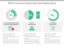 Kpi for incorrect stock size used safety stock presentation slide
Presenting kpi for incorrect stock size used safety stock presentation slide. This presentation slide shows Three Key Performance Indicators or KPIs in a Dashboard style design. The first KPI that can be shown is Percentage of Inventory Items with Incorrect Stock Balances. The second KPI is Size of Safety Stock. The third is Percentage of Safety Stock Used.These KPI Powerpoint graphics are all data driven, and the shape automatically adjusts according to your data. Just right click on the KPI graphic, enter the right value and the shape will adjust automatically. Make a visual impact with our KPI slides.
-
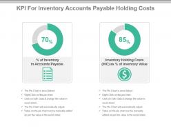 Kpi for inventory accounts payable holding costs powerpoint slide
Presenting kpi for inventory accounts payable holding costs powerpoint slide. This presentation slide shows Two Key Performance Indicators or KPIs in a Dashboard style design. The first KPI that can be shown is Percentage of Inventory in Accounts Payable. The second KPI is Inventory Holding Costs or IHC as Percentage of Inventory Value. These KPI Powerpoint graphics are all data driven, and the shape automatically adjusts according to your data. Just right click on the KPI graphic, enter the right value and the shape will adjust automatically. Make a visual impact with our KPI slides.
-
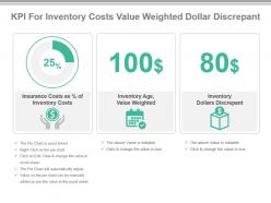 Kpi for inventory costs value weighted dollar discrepant ppt slide
Presenting kpi for inventory costs value weighted dollar discrepant ppt slide. This presentation slide shows Three Key Performance Indicators or KPIs in a Dashboard style design. The first KPI that can be shown is Insurance Costs as Percentage of Inventory Costs. The second KPI is Inventory Age, Value Weighted. The third is Inventory Dollars Discrepant. These KPI Powerpoint graphics are all data driven, and the shape automatically adjusts according to your data. Just right click on the KPI graphic, enter the right value and the shape will adjust automatically. Make a visual impact with our KPI slides.
-
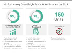 Kpi for inventory gross margin return service level inactive stock presentation slide
Presenting kpi for inventory gross margin return service level inactive stock presentation slide. This presentation slide shows Three Key Performance Indicators or KPIs in a Dashboard style design. The first KPI that can be shown is Gross Margin Return on Inventory Investment. The second KPI is Inventory Service Level. The third is Inactive Stock. These KPI Powerpoint graphics are all data driven, and the shape automatically adjusts according to your data. Just right click on the KPI graphic, enter the right value and the shape will adjust automatically. Make a visual impact with our KPI slides.
-
 Kpi for picked line items dock to stock time goods ratio powerpoint slide
Presenting kpi for picked line items dock to stock time goods ratio powerpoint slide. This presentation slide shows Three Key Performance Indicators or KPIs in a Dashboard style design. The first KPI that can be shown is Percentage of Correctly Picked Line Items. The second KPI is Average Dock to Stock Time for Receiving. The third is Inventory to Obsolete Goods Ratio. These KPI Powerpoint graphics are all data driven, and the shape automatically adjusts according to your data. Just right click on the KPI graphic, enter the right value and the shape will adjust automatically. Make a visual impact with our KPI slides.
-
 Kpi for stock available stock controlled skus ppt slide
Presenting kpi for stock available stock controlled skus ppt slide. This presentation slide shows Two Key Performance Indicators or KPIs in a Dashboard style design. The first KPI that can be shown is Percentage of Stock Available at Customers First Request. The second KPI is Percentage of Stock Controlled SKUs. These KPI Powerpoint graphics are all data driven, and the shape automatically adjusts according to your data. Just right click on the KPI graphic, enter the right value and the shape will adjust automatically. Make a visual impact with our KPI slides.
-
 Safety stock kpi for inventory management holding costs presentation slide
Presenting safety stock kpi for inventory management holding costs presentation slide. This presentation slide shows Two Key Performance Indicators or KPIs in a Dashboard style design. The first KPI that can be shown is Inventory Management Cost as Percentage of Gross Sales. The second KPI is Inventory Holding Costs or IHC as Percentage of Gross Sales. These KPI Powerpoint graphics are all data driven, and the shape automatically adjusts according to your data. Just right click on the KPI graphic, enter the right value and the shape will adjust automatically. Make a visual impact with our KPI slides.
-
 Stock time kpi for inspection testing lead time variability powerpoint slide
Presenting stock time kpi for inspection testing lead time variability powerpoint slide. This presentation slide shows Two Key Performance Indicators or KPIs in a Dashboard style design. The first KPI that can be shown is Average Dock to Stock Time for Inspection Testing. The second KPI is Percent Variability in Lead Time. These KPI Powerpoint graphics are all data driven, and the shape automatically adjusts according to your data. Just right click on the KPI graphic, enter the right value and the shape will adjust automatically. Make a visual impact with our KPI slides.
-
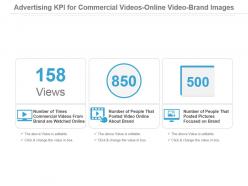 Advertising kpi for commercial videos online video brand images powerpoint slide
Presenting advertising kpi for commercial videos online video brand images powerpoint slide. This presentation slide shows three Key Performance Indicators or KPIs in a Dashboard style design. The first KPI that can be shown is Number of Times Commercial Videos From Brand are Watched Online. The second KPI is Number of People That Posted Video Online About Brand and the third is Number of People That Posted Pictures Focused on Brand. These KPI Powerpoint graphics are all data driven, and the shape automatically adjusts according to your data. Just right click on the KPI graphic, enter the right value and the shape will adjust automatically. Make a visual impact with our KPI slides.
-
 Brand Followers Kpi On Social Networks Microblogging Site Focused Groups Ppt Slide
Presenting brand followers kpi on social networks microblogging site focused groups ppt slide. This presentation slide shows three Key Performance Indicators or KPIs in a Dashboard style design. The first KPI that can be shown is Number of Followers of Brand on Social Networks. The second KPI is Number of Followers of Brand on Micro Blogging Site and the third is Number of People That Joined Groups Focused on Brand. These KPI Powerpoint graphics are all data driven, and the shape automatically adjusts according to your data. Just right click on the KPI graphic, enter the right value and the shape will adjust automatically. Make a visual impact with our KPI slides.
-
 Branding Kpi For Micro Blog Post Social Network Brand Survey Presentation Slide
Presenting branding kpi for micro blog post social network brand survey presentation slide. This presentation slide shows three Key Performance Indicators or KPIs in a Dashboard style design. The first KPI that can be shown is Number of People That Posted a Micro Blog About Brand. The second KPI is Number of People That Posted Social Network Status Focused on Brand and the third is Number of People That Joined Online Panel or Survey For Brand. These KPI Powerpoint graphics are all data driven, and the shape automatically adjusts according to your data. Just right click on the KPI graphic, enter the right value and the shape will adjust automatically. Make a visual impact with our KPI slides.
-
 Content creation kpi for story published about page powerpoint slide
Presenting content creation kpi for story published about page powerpoint slide. This presentation slide shows two Key Performance Indicators or KPIs in a Dashboard style design. The first KPI that can be shown is Number of Impressions of a Story Published By a Friend About Your Page. The second KPI is Number of People Who Saw Your Page or One of Its Posts From a Story Published By a Friend. These KPI Powerpoint graphics are all data driven, and the shape automatically adjusts according to your data. Just right click on the KPI graphic, enter the right value and the shape will adjust automatically. Make a visual impact with our KPI slides.
-
 Conversion rate percentage kpi for social media online traffic ppt slide
Presenting conversion rate percentage kpi for social media online traffic ppt slide. This presentation slide shows one Key Performance Indicators or KPIs in a Dashboard style design. The first KPI that can be shown is Conversion Rate of Social Media Online Traffic. These KPI Powerpoint graphics are all data driven, and the shape automatically adjusts according to your data. Just right click on the KPI graphic, enter the right value and the shape will adjust automatically. Make a visual impact with our KPI slides.
-
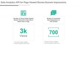 Data analytics kpi for page viewed stories domain impressions presentation slide
Presenting data analytics kpi for page viewed stories domain impressions presentation slide. This presentation slide shows two Key Performance Indicators or KPIs in a Dashboard style design. The first KPI that can be shown is Number of Times People Viewed Stories That Link to Your Site in News Feed or Page. The second KPI is Number of Comments Box Impressions on Your Domain. These KPI Powerpoint graphics are all data driven, and the shape automatically adjusts according to your data. Just right click on the KPI graphic, enter the right value and the shape will adjust automatically. Make a visual impact with our KPI slides.
-
 E resources and content kpi for page content likes number of posts powerpoint slide
Presenting e resources and content kpi for page content likes number of posts powerpoint slide. This presentation slide shows two Key Performance Indicators or KPIs in a Dashboard style design. The first KPI that can be shown is Number of Likes of Your Pages Content. The second KPI is Number of Posts to Your Page. These KPI Powerpoint graphics are all data driven, and the shape automatically adjusts according to your data. Just right click on the KPI graphic, enter the right value and the shape will adjust automatically. Make a visual impact with our KPI slides.
-
 E resources and content kpi for post impressions viewed page posts ppt slide
Presenting e resources and content kpi for post impressions viewed page posts ppt slide. This presentation slide shows two Key Performance Indicators or KPIs in a Dashboard style design. The first KPI that can be shown is Number of Discussions Created on Your Pages Discussion Board. The second KPI is Number of Existing Reviews Modified For Your Page. These KPI Powerpoint graphics are all data driven, and the shape automatically adjusts according to your data. Just right click on the KPI graphic, enter the right value and the shape will adjust automatically. Make a visual impact with our KPI slides.
-
 E resources kpi for clicked content viewed page deleted comments presentation slide
Presenting e resources kpi for clicked content viewed page deleted comments presentation slide. This presentation slide shows three Key Performance Indicators or KPIs in a Dashboard style design. The first KPI that can be shown is Number of People Who Clicked on Any of Your Content Without Generating a Story. The second KPI is Number of People Who Have Interacted With or Viewed Your Page or Its Posts and the third is Number of Comments Deleted on Your Pages Content. These KPI Powerpoint graphics are all data driven, and the shape automatically adjusts according to your data. Just right click on the KPI graphic, enter the right value and the shape will adjust automatically. Make a visual impact with our KPI slides.
-
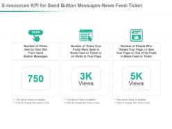 E resources kpi for send button messages news feed ticker powerpoint slide
Presenting e resources kpi for send button messages news feed ticker powerpoint slide. This presentation slide shows three Key Performance Indicators or KPIs in a Dashboard style design. The first KPI that can be shown is Number of Clicks Sent to Your Site From Send Button Messages. The second KPI is Number of Times Your Posts Were Seen in News Feed or Ticker or on Visits to Your Page and the third is Number of People Who Visited Your Page, or Saw Your Page or One of Its Posts in News Feed or Ticker. These KPI Powerpoint graphics are all data driven, and the shape automatically adjusts according to your data. Just right click on the KPI graphic, enter the right value and the shape will adjust automatically. Make a visual impact with our KPI slides.
-
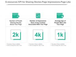 E resources kpi for sharing stories page impressions page like ppt slide
Presenting e resources kpi for sharing stories page impressions page like ppt slide. This presentation slide shows three Key Performance Indicators or KPIs in a Dashboard style design. The first KPI that can be shown is Number of People Sharing Stories About Your Page. The second KPI is Number of Impressions Seen of Any Content Associated With Your Page and the third is Average Age of People Who Like Your Page. These KPI Powerpoint graphics are all data driven, and the shape automatically adjusts according to your data. Just right click on the KPI graphic, enter the right value and the shape will adjust automatically. Make a visual impact with our KPI slides.
-
 E resources kpi for site link post page content news feed story presentation slide
Presenting e resources kpi for site link post page content news feed story presentation slide. This presentation slide shows three Key Performance Indicators or KPIs in a Dashboard style design. The first KPI that can be shown is Number of Times People Posted a Link to Your Site Through an Action. The second KPI is Number of People Who Have Seen Any Content Associated With Your Page and the third is Number of Times People Have Viewed a News Feed Story Posted By Your Page. These KPI Powerpoint graphics are all data driven, and the shape automatically adjusts according to your data. Just right click on the KPI graphic, enter the right value and the shape will adjust automatically. Make a visual impact with our KPI slides.
-
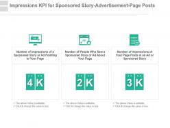 Impressions kpi for sponsored story advertisement page posts powerpoint slide
Presenting impressions kpi for sponsored story advertisement page posts powerpoint slide. This presentation slide shows three Key Performance Indicators or KPIs in a Dashboard style design. The first KPI that can be shown is Number of Impressions of a Sponsored Story or Ad Pointing to Your Page. The second KPI is Number of People Who Saw a Sponsored Story or Ad About Your Page and the third is Number of Impressions of Your Page Posts in an Ad or Sponsored Story. These KPI Powerpoint graphics are all data driven, and the shape automatically adjusts according to your data. Just right click on the KPI graphic, enter the right value and the shape will adjust automatically. Make a visual impact with our KPI slides.
-
 Klout score potential reach number of uploads social media kpi ppt slide
Presenting klout score potential reach number of uploads social media kpi ppt slide. This presentation slide shows three Key Performance Indicators or KPIs in a Dashboard style design. The first KPI that can be shown is Klout Score. The second KPI is Potential Reach and the third is Number of uploads. These KPI Powerpoint graphics are all data driven, and the shape automatically adjusts according to your data. Just right click on the KPI graphic, enter the right value and the shape will adjust automatically. Make a visual impact with our KPI slides.
-
 Kpi for account users non existing account users page stories presentation slide
Presenting kpi for account users non existing account users page stories presentation slide. This presentation slide shows three Key Performance Indicators or KPIs in a Dashboard style design. The first KPI that can be shown is Number of Views of Page From Logged in Users. The second KPI is Number of Views of Page From Not Logged in Users and the third is Number of Stories Created About Your Page. These KPI Powerpoint graphics are all data driven, and the shape automatically adjusts according to your data. Just right click on the KPI graphic, enter the right value and the shape will adjust automatically. Make a visual impact with our KPI slides.
-
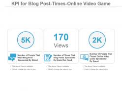 Kpi For Blog Post Times Online Video Game Ppt Slide
Presenting kpi for blog post times online video game ppt slide. This presentation slide shows three Key Performance Indicators or KPIs in a Dashboard style design. The first KPI that can be shown is Number of People That Read Blog Post Sponsored By Brand. The second KPI is Number of Times That Blog Posts Sponsored By Brand Are Read and the third is Number of People That Played Online Video Game Sponsored By Brand. These KPI Powerpoint graphics are all data driven, and the shape automatically adjusts according to your data. Just right click on the KPI graphic, enter the right value and the shape will adjust automatically. Make a visual impact with our KPI slides.
-
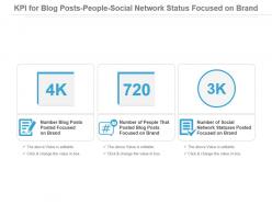 Kpi For Blog Posts People Social Network Status Focused On Brand Powerpoint Slide
Presenting kpi for blog posts people social network status focused on brand powerpoint slide. This presentation slide shows three Key Performance Indicators or KPIs in a Dashboard style design. The first KPI that can be shown is Number Blog Posts Posted Focused on Brand. The second KPI is Number of People That Posted Blog Posts Focused on Brand and the third is Number of Social Network Statuses Posted Focused on Brand. These KPI Powerpoint graphics are all data driven, and the shape automatically adjusts according to your data. Just right click on the KPI graphic, enter the right value and the shape will adjust automatically. Make a visual impact with our KPI slides.
-
Easily Editable.
-
Wonderful templates design to use in business meetings.
-
Nice and innovative design.
-
Amazing product with appealing content and design.
-
Informative design.
-
Great designs, really helpful.
-
Amazing product with appealing content and design.
-
Use of different colors is good. It's simple and attractive.
-
Presentation Design is very nice, good work with the content as well.
-
Visually stunning presentation, love the content.


