Powerpoint Templates and Google slides for Average Time
Save Your Time and attract your audience with our fully editable PPT Templates and Slides.
-
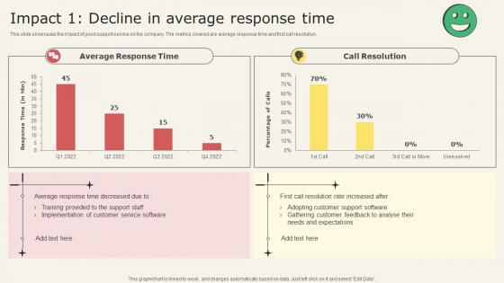 Analyzing Metrics To Improve Customer Experience Impact 1 Decline In Average Response Time
This slide showcases the impact of good support service on the company. The metrics covered are average response time and first call resolution. Present the topic in a bit more detail with this Analyzing Metrics To Improve Customer Experience Impact 1 Decline In Average Response Time. Use it as a tool for discussion and navigation on Customer Needs And Expectations, Adopting Customer, Support Software, Customer Feedback. This template is free to edit as deemed fit for your organization. Therefore download it now.
-
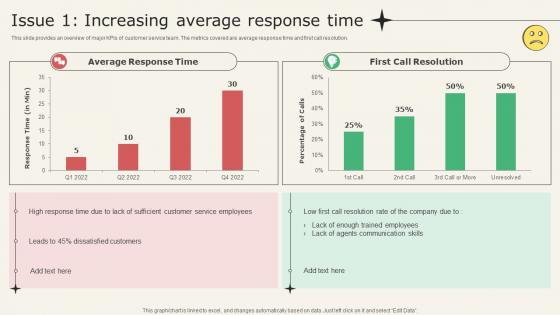 Analyzing Metrics To Improve Customer Experience Issue 1 Increasing Average Response Time
This slide provides an overview of major KPIs of customer service team. The metrics covered are average response time and first call resolution. Present the topic in a bit more detail with this Analyzing Metrics To Improve Customer Experience Issue 1 Increasing Average Response Time. Use it as a tool for discussion and navigation on Average Response Time, First Call Resolution, Communication Skills. This template is free to edit as deemed fit for your organization. Therefore download it now.
-
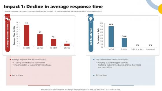 Impact 1 Decline In Average Response Time Enhancing Customer Experience Using Improvement
This slide showcases the impact of good support service on the company. The metrics covered are average response time and first call resolution. Deliver an outstanding presentation on the topic using this Impact 1 Decline In Average Response Time Enhancing Customer Experience Using Improvement. Dispense information and present a thorough explanation of Customer Service Software, Support Staff, Expectations, Customer Feedback using the slides given. This template can be altered and personalized to fit your needs. It is also available for immediate download. So grab it now.
-
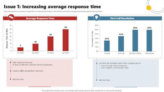 Issue 1 Increasing Average Response Time Enhancing Customer Experience Using Improvement
This slide provides an overview of major KPIs of customer service team. The metrics covered are average response time and first call resolution. Present the topic in a bit more detail with this Issue 1 Increasing Average Response Time Enhancing Customer Experience Using Improvement. Use it as a tool for discussion and navigation on Customer Service Employees, Dissatisfied Customers, Communication Skills. This template is free to edit as deemed fit for your organization. Therefore download it now.
-
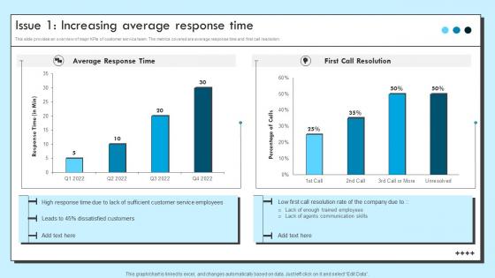 Issue 1 Increasing Average Response Time Improvement Strategies For Support
This slide provides an overview of major KPIs of customer service team. The metrics covered are average response time and first call resolution. Deliver an outstanding presentation on the topic using this Issue 1 Increasing Average Response Time Improvement Strategies For Support. Dispense information and present a thorough explanation of Average Response Time, First Call Resolution using the slides given. This template can be altered and personalized to fit your needs. It is also available for immediate download. So grab it now.
-
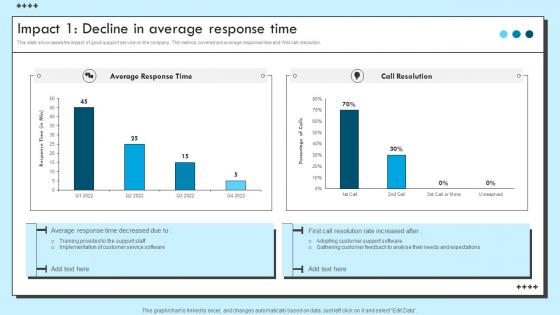 Impact 1 Decline In Average Response Time Improvement Strategies For Support
This slide showcases the impact of good support service on the company. The metrics covered are ticket backlog and support cost. Deliver an outstanding presentation on the topic using this Impact 1 Decline In Average Response Time Improvement Strategies For Support. Dispense information and present a thorough explanation of Average Response Time, Call Resolution using the slides given. This template can be altered and personalized to fit your needs. It is also available for immediate download. So grab it now.
-
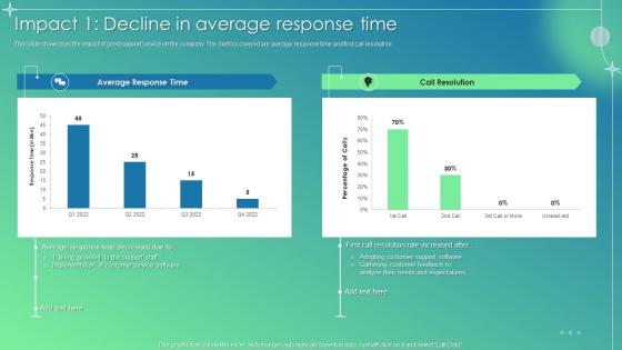 Customer Service Improvement Plan Impact 1 Decline In Average Response Time
This slide showcases the impact of good support service on the company. The metrics covered are average response time and first call resolution. Present the topic in a bit more detail with this Customer Service Improvement Plan Impact 1 Decline In Average Response Time. Use it as a tool for discussion and navigation on Call Resolution, Training Provided, Support Staff, Customer Service Software. This template is free to edit as deemed fit for your organization. Therefore download it now.
-
 Customer Service Improvement Plan Issue 1 Increasing Average Response Time
This slide provides an overview of major KPIs of customer service team. The metrics covered are average response time and first call resolution. Deliver an outstanding presentation on the topic using this Customer Service Improvement Plan Issue 1 Increasing Average Response Time. Dispense information and present a thorough explanation of Average Response Time, First Call Resolution, Agents Communication Skills using the slides given. This template can be altered and personalized to fit your needs. It is also available for immediate download. So grab it now.
-
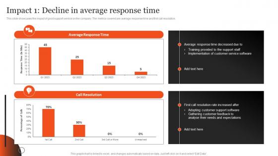 Impact 1 Decline In Average Response Time Plan Optimizing After Sales Services
This slide showcases the impact of good support service on the company. The metrics covered are average response time and first call resolution.Deliver an outstanding presentation on the topic using this Impact 1 Decline In Average Response Time Plan Optimizing After Sales Services. Dispense information and present a thorough explanation of Implementation Customer, Adopting Customer, Needs Expectations using the slides given. This template can be altered and personalized to fit your needs. It is also available for immediate download. So grab it now.
-
 Issue 1 Increasing Average Response Time Plan Optimizing After Sales Services
This slide provides an overview of major KPIs of customer service team. The metrics covered are average response time and first call resolution.Present the topic in a bit more detail with this Issue 1 Increasing Average Response Time Plan Optimizing After Sales Services. Use it as a tool for discussion and navigation on Average Response, Call Resolution, Dissatisfied Customers. This template is free to edit as deemed fit for your organization. Therefore download it now.
-
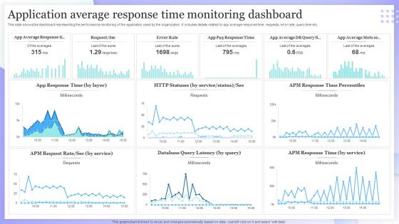 Application Average Response Time Monitoring Dashboard
This slide shows the dashboard representing the performance monitoring of the application used by the organization. It includes details related to app average response time, requests, error rate, query time etc. Introducing our Application Average Response Time Monitoring Dashboard set of slides. The topics discussed in these slides are App Response Time, Database Query Latency. This is an immediately available PowerPoint presentation that can be conveniently customized. Download it and convince your audience.
-
 Hospital KPI Dashboard With Average Waiting Time Strategic Healthcare Marketing Plan Strategy SS
The following slide outlines key performance indicator KPI dashboard that can be used by healthcare professionals to evaluate hospital performance. The metrics outlined in slide are total patients, average treatment costs, available staff, patients by division, etc. Deliver an outstanding presentation on the topic using this Hospital KPI Dashboard With Average Waiting Time Strategic Healthcare Marketing Plan Strategy SS. Dispense information and present a thorough explanation of Outpatients, Inpatients Trend, Patient By Division using the slides given. This template can be altered and personalized to fit your needs. It is also available for immediate download. So grab it now.
-
 Kpi for average backup time security controls risks identified powerpoint slide
Presenting kpi for average backup time security controls risks identified powerpoint slide. This presentation slide shows three Key Performance Indicators or KPIs in a Dashboard style design. The first KPI that can be shown is Average Time Between Tests of Backup. The second KPI is Proportion of Information Security Risks for Which Satisfactory Controls Have Been Fully Implemented and the third is Relative Proportions of Risks Identified. These KPI Powerpoint graphics are all data driven,and the shape automatically adjusts according to your data. Just right click on the KPI graphic,enter the right value and the shape will adjust automatically. Make a visual impact with our KPI slides.
-
 Kpi for average time to patent claims carried prosecutions lawyer cost good ppt slide
Presenting kpi for average time to patent claims carried prosecutions lawyer cost good ppt slide. This presentation slide shows three Key Performance Indicators or KPIs in a Dashboard style design. The first KPI that can be shown is Average Time to Prepare Patent Claims. The second KPI is Number of Prosecutions Carried Out Per Fte and the third is Cost Per Hour Per Laywer in House. These KPI Powerpoint graphics are all data driven,and the shape automatically adjusts according to your data. Just right click on the KPI graphic,enter the right value and the shape will adjust automatically. Make a visual impact with our KPI slides.
-
 Kpi for physical successful back up average time to restore backup powerpoint slide
Presenting kpi for physical successful back up average time to restore backup powerpoint slide. This presentation slide shows three Key Performance Indicators or KPIs in a Dashboard style design. The first KPI that can be shown is percentage of Physical Backup Archive Media That are Fully Encrypted. The second KPI is percentage of Test Backup Restores That are Successful and the third is Average Time to Restore off Site Backup. These KPI Powerpoint graphics are all data driven,and the shape automatically adjusts according to your data. Just right click on the KPI graphic,enter the right value and the shape will adjust automatically. Make a visual impact with our KPI slides.
-
 E metrics kpi for average user website time conversion rate powerpoint slide
Presenting e metrics kpi for average user website time conversion rate powerpoint slide. This presentation slide shows two Key Performance Indicators or KPIs in a Dashboard style design. The first KPI that can be shown is Average Time on Website. The second KPI is Conversion Rate. These KPI Powerpoint graphics are all data driven, and the shape automatically adjusts according to your data. Just right click on the KPI graphic, enter the right value and the shape will adjust automatically. Make a visual impact with our KPI slides.
-
 Ship kpi for average corrective preventive maintenance time powerpoint slide
Presenting ship kpi for average corrective preventive maintenance time powerpoint slide. This presentation slide shows three Key Performance Indicators or KPIs in a Dashboard style design. The first KPI that can be shown is Average Corrective Maintenance Time Per Ship. The second KPI is Average Preventive Maintenance Time Per Ship and the third is Ratio Corrective Versus Preventive Maintenance Time Per Ship. These KPI Powerpoint graphics are all data driven, and the shape automatically adjusts according to your data. Just right click on the KPI graphic, enter the right value and the shape will adjust automatically. Make a visual impact with our KPI slides.
-
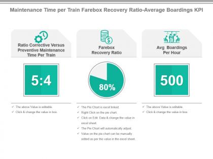 Maintenance time per train farebox recovery ratio average boardings kpi presentation slide
Presenting maintenance time per train farebox recovery ratio average boardings kpi presentation slide. This presentation slide shows Three Key Performance Indicators or KPIs in a Dashboard style design. The first KPI that can be shown is Ratio Corrective Versus Preventive Maintenance Time Per Train. The second KPI is Farebox Recovery Ratio. The third is Avg Boardings Per Hour. These KPI Powerpoint graphics are all data driven, and the shape automatically adjusts according to your data. Just right click on the KPI graphic, enter the right value and the shape will adjust automatically. Make a visual impact with our KPI slides.
-
 Ratio fixed average corrective maintenance time variable costs kpi presentation slide
Presenting ratio fixed average corrective maintenance time variable costs kpi presentation slide. This presentation slide shows Three Key Performance Indicators or KPIs in a Dashboard style design. The first KPI that can be shown is Ratio Fixed Versus Variable Costs Per Truck. The second KPI is Average Corrective Maintenance Time Per Truck. The third is Average Variable Costs Per Truck. These KPI Powerpoint graphics are all data driven, and the shape automatically adjusts according to your data. Just right click on the KPI graphic, enter the right value and the shape will adjust automatically. Make a visual impact with our KPI slides.
-
 Airline kpi for turnaround time average ticket prices freight revenue presentation slide
Presenting airline kpi for turnaround time average ticket prices freight revenue presentation slide. This presentation slide shows three Key Performance Indicators or KPIs in a Dashboard style design. The first KPI that can be shown is Turnaround Time. The second KPI is Average Ticket Prices and the third is Average Freight Revenue Per Ton Mile. These KPI Powerpoint graphics are all data driven, and the shape automatically adjusts according to your data. Just right click on the KPI graphic, enter the right value and the shape will adjust automatically. Make a visual impact with our KPI slides.
-
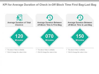 Kpi for average duration of check in off block time first bag last bag presentation slide
Presenting kpi for average duration of check in off block time first bag last bag presentation slide. This presentation slide shows three Key Performance Indicators or KPIs in a Dashboard style design. The first KPI that can be shown is Average Duration of Total Check in. The second KPI is Average Duration Between off Block Time And First Bag and the third is Average Duration Between off Block Time And Last Bag. These KPI Powerpoint graphics are all data driven, and the shape automatically adjusts according to your data. Just right click on the KPI graphic, enter the right value and the shape will adjust automatically. Make a visual impact with our KPI slides.
-
 Kpi for average immigration time weather delays check in counters powerpoint slide
Presenting kpi for average immigration time weather delays check in counters powerpoint slide. This presentation slide shows three Key Performance Indicators or KPIs in a Dashboard style design. The first KPI that can be shown is Average Immigration Time. The second KPI is Average Number of Weather Delays and the third is Average Number of Check in Counters Per Flight. These KPI Powerpoint graphics are all data driven, and the shape automatically adjusts according to your data. Just right click on the KPI graphic, enter the right value and the shape will adjust automatically. Make a visual impact with our KPI slides.
-
 Kpi for average maintenance costs maintenance time per truck ppt slide
Presenting kpi for average maintenance costs maintenance time per truck ppt slide. This presentation slide shows two Key Performance Indicators or KPIs in a Dashboard style design. The first KPI that can be shown is Average Maintenance Costs Per Truck. The second KPI is Average Maintenance Time Per Truck. These KPI Powerpoint graphics are all data driven, and the shape automatically adjusts according to your data. Just right click on the KPI graphic, enter the right value and the shape will adjust automatically. Make a visual impact with our KPI slides.
-
 Kpi for average maintenance costs time aircraft emissions presentation slide
Presenting kpi for average maintenance costs time aircraft emissions presentation slide. This presentation slide shows three Key Performance Indicators or KPIs in a Dashboard style design. The first KPI that can be shown is Average Maintenance Costs Per Airplane. The second KPI is Average Maintenance Time Per Airplane and the third is Aircraft Emissions Per Payload Capacity. These KPI Powerpoint graphics are all data driven, and the shape automatically adjusts according to your data. Just right click on the KPI graphic, enter the right value and the shape will adjust automatically. Make a visual impact with our KPI slides.
-
 Kpi for average time to deliver employee costs profit per delivery powerpoint slide
Presenting kpi for average time to deliver employee costs profit per delivery powerpoint slide. This presentation slide shows three Key Performance Indicators or KPIs in a Dashboard style design. The first KPI that can be shown is Average Time to Deliver. The second KPI is Employee Costs Per Delivery and the third is Profit Per Delivery. These KPI Powerpoint graphics are all data driven, and the shape automatically adjusts according to your data. Just right click on the KPI graphic, enter the right value and the shape will adjust automatically. Make a visual impact with our KPI slides.
-
 Kpi for profit average employee costs dentist time per treatment powerpoint slide
Presenting kpi for profit average employee costs dentist time per treatment powerpoint slide. This presentation slide shows three Key Performance Indicators or KPIs in a Dashboard style design. The first KPI that can be shown is Profit Per Dentist Treatment. The second KPI is Average Employee Costs Per Dentist Treatment and the third is Average Dentist Time Per Dentist Treatment. These KPI Powerpoint graphics are all data driven, and the shape automatically adjusts according to your data. Just right click on the KPI graphic, enter the right value and the shape will adjust automatically. Make a visual impact with our KPI slides.
-
 Nursing kpi for patient time average nurse per patient total visits presentation slide
Presenting nursing kpi for patient time average nurse per patient total visits presentation slide. This presentation slide shows three Key Performance Indicators or KPIs in a Dashboard style design. The first KPI that can be shown is Total Nurse Patient Facing Time. The second KPI is Average Nurse Patient Facing Time Per Patient and the third is Total Number of Nurse Patient Visits. These KPI Powerpoint graphics are all data driven, and the shape automatically adjusts according to your data. Just right click on the KPI graphic, enter the right value and the shape will adjust automatically. Make a visual impact with our KPI slides.
-
 Dentist kpi for average total costs fixed costs occupation time presentation slide
Presenting dentist kpi for average total costs fixed costs occupation time presentation slide. This presentation slide shows three Key Performance Indicators or KPIs in a Dashboard style design. The first KPI that can be shown is Average Total Costs Per Dentist Treatment. The second KPI is Average Fixed Costs Per Dentist Treatment and the third is Dentist Chair Occupation Time percentage. These KPI Powerpoint graphics are all data driven, and the shape automatically adjusts according to your data. Just right click on the KPI graphic, enter the right value and the shape will adjust automatically. Make a visual impact with our KPI slides.
-
 Hospital kpi for average occupation discharge time patient stay time ppt slide
Presenting hospital kpi for average occupation discharge time patient stay time ppt slide. This presentation slide shows three Key Performance Indicators or KPIs in a Dashboard style design. The first KPI that can be shown is Average Occupation Time of Hospital Bed. The second KPI is Average Discharge Time of Patient and the third is Average Length of Stay for Patients. These KPI Powerpoint graphics are all data driven, and the shape automatically adjusts according to your data. Just right click on the KPI graphic, enter the right value and the shape will adjust automatically. Make a visual impact with our KPI slides.
-
 Kpi for average x ray consultation time percentage of emergency x rays presentation slide
Presenting kpi for average x ray consultation time percentage of emergency x rays presentation slide. This presentation slide shows two Key Performance Indicators or KPIs in a Dashboard style design. The first KPI that can be shown is Average Time of X ray Consultation. The second KPI is percentage of Emergency X rays. These KPI Powerpoint graphics are all data driven, and the shape automatically adjusts according to your data. Just right click on the KPI graphic, enter the right value and the shape will adjust automatically. Make a visual impact with our KPI slides.
-
 Kpi for inventory replenishment cycle time average unit cost presentation slide
Presenting kpi for inventory replenishment cycle time average unit cost presentation slide. This presentation slide shows two Key Performance Indicators or KPIs in a Dashboard style design. The first KPI that can be shown is Inventory Replenishment Cycle Time. The second KPI is Average Unit Cost. These KPI Powerpoint graphics are all data driven, and the shape automatically adjusts according to your data. Just right click on the KPI graphic, enter the right value and the shape will adjust automatically. Make a visual impact with our KPI slides.
-
 Audit kpi dashboard showing lead time average entry variance and amount contribution
Presenting this set of slides with name - Audit Kpi Dashboard Showing Lead Time Average Entry Variance And Amount Contribution. This is a four stage process. The stages in this process are Audit, Examine, Survey.
-
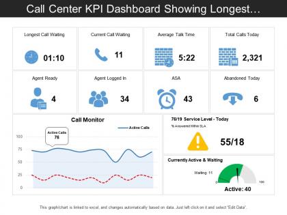 Call center kpi dashboard showing longest call waiting and average talk time
Presenting this set of slides with name - Call Center Kpi Dashboard Showing Longest Call Waiting And Average Talk Time. This is a three stage process. The stages in this process are Call Center Agent, Customer Care, Client Support.
-
 Entertainment recreation and arts kpi dashboard average annual expenditure and time spent
Presenting this set of slides with name - Entertainment Recreation And Arts Kpi Dashboard Average Annual Expenditure And Time Spent. This is a three stage process. The stages in this process are Entertainment, Recreation And Arts, Attractions, Culture, Entertainment.
-
 Healthcare dashboard with average time of division and patient satisfaction
Presenting this set of slides with name - Healthcare Dashboard With Average Time Of Division And Patient Satisfaction. This is a five stage process. The stages in this process are Healthcare, Health Improvement, Medical Care.
-
 Procurement average time to procure dashboard
Presenting this set of slides with name - Procurement Average Time To Procure Dashboard. This is a seven stage process. The stages in this process are Purchase, Procurement, Buy.
-
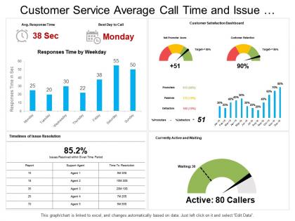 Customer service average call time and issue resolution timeline dashboard
Introducing customer service average call time and issue resolution timeline dashboard PPT slide. This format slide is totally adaptable with Google Slide. You can adjust the tints, content style, text dimension of the slide information according to require. The slide rushes to download and can be spared in PDF, and JPEG designs. For direction, extra instructive slides are given. Best quality designs are used. The nature of the slide illustrations does not obscure when shown on an expansive screen. You can customize the slide by including your association name, and mark.
-
 Average part time hours per year ppt powerpoint presentation outline model cpb
Presenting Average Part Time Hours Per Year Ppt Powerpoint Presentation Outline Model Cpb slide which is completely adaptable. The graphics in this PowerPoint slide showcase three stages that will help you succinctly convey the information. In addition, you can alternate the color, font size, font type, and shapes of this PPT layout according to your content. This PPT presentation can be accessed with Google Slides and is available in both standard screen and widescreen aspect ratios. It is also a useful set to elucidate topics like Average Part Time Hours Per Year. This well structured design can be downloaded in different formats like PDF, JPG, and PNG. So, without any delay, click on the download button now.
-
 Time average number employees ppt powerpoint presentation model design templates cpb
Presenting Time Average Number Employees Ppt Powerpoint Presentation Model Design Templates Cpb slide which is completely adaptable. The graphics in this PowerPoint slide showcase six stages that will help you succinctly convey the information. In addition, you can alternate the color, font size, font type, and shapes of this PPT layout according to your content. This PPT presentation can be accessed with Google Slides and is available in both standard screen and widescreen aspect ratios. It is also a useful set to elucidate topics like Time Average Number Employees. This well-structured design can be downloaded in different formats like PDF, JPG, and PNG. So, without any delay, click on the download button now.
-
 Average response time ppt powerpoint presentation pictures example introduction cpb
Presenting our Average Response Time Ppt Powerpoint Presentation Pictures Example Introduction Cpb PowerPoint template design. This PowerPoint slide showcases three stages. It is useful to share insightful information on Average Response Time This PPT slide can be easily accessed in standard screen and widescreen aspect ratios. It is also available in various formats like PDF, PNG, and JPG. Not only this, the PowerPoint slideshow is completely editable and you can effortlessly modify the font size, font type, and shapes according to your wish. Our PPT layout is compatible with Google Slides as well, so download and edit it as per your knowledge.
-
 Dapps IT Average Dapp Development Timeline Ppt Powerpoint Presentation Slides Infographics
This slide demonstrates the average timeframe required to develop a decentralized app based on various phases such as strategy, design, development, testing, and launch. Present the topic in a bit more detail with this Dapps IT Average Dapp Development Timeline Ppt Powerpoint Presentation Slides Infographics. Use it as a tool for discussion and navigation on Strategy, Design, Development. This template is free to edit as deemed fit for your organization. Therefore download it now.
-
 Average Dapp Development Timeline Ppt Portfolio Guidelines
This slide demonstrates the average timeframe required to develop a decentralized app based on various phases such as strategy, design, development, testing, and launch. Present the topic in a bit more detail with this Average Dapp Development Timeline Ppt Portfolio Guidelines. Use it as a tool for discussion and navigation on Design, Development, Strategy, Launch. This template is free to edit as deemed fit for your organization. Therefore download it now.
-
 Analyzing Average Time On Page To Improve Landing Page Content Marketing Analytics Guide
This slide covers an overview of the average time on the page to identify the amount of time a visitor spends on the landing page. It also includes strategies to improve, such as decreasing load time, improving post readability, and using exit intent popups. Present the topic in a bit more detail with this Analyzing Average Time On Page To Improve Landing Page Content Marketing Analytics Guide. Use it as a tool for discussion and navigation on Analyzing average, improve landing, page content. This template is free to edit as deemed fit for your organization. Therefore download it now.
-
 Decentralized Apps Average DApp Development Timeline Ppt Pictures Icons
This slide demonstrates the average timeframe required to develop a decentralized app based on various phases such as strategy, design, development, testing, and launch. Present the topic in a bit more detail with this Decentralized Apps Average DApp Development Timeline Ppt Pictures Icons. Use it as a tool for discussion and navigation on Strategy, Timeline, Development. This template is free to edit as deemed fit for your organization. Therefore download it now.
-
 Average Bitcoin Transaction Time In Powerpoint And Google Slides Cpb
Presenting Average Bitcoin Transaction Time In Powerpoint And Google Slides Cpb slide which is completely adaptable. The graphics in this PowerPoint slide showcase four stages that will help you succinctly convey the information. In addition, you can alternate the color, font size, font type, and shapes of this PPT layout according to your content. This PPT presentation can be accessed with Google Slides and is available in both standard screen and widescreen aspect ratios. It is also a useful set to elucidate topics like Average Bitcoin Transaction Time. This well structured design can be downloaded in different formats like PDF, JPG, and PNG. So, without any delay, click on the download button now.
-
 Bitcoin Average Transaction Time In Powerpoint And Google Slides Cpb
Presenting Bitcoin Average Transaction Time In Powerpoint And Google Slides Cpb slide which is completely adaptable. The graphics in this PowerPoint slide showcase five stages that will help you succinctly convey the information. In addition, you can alternate the color, font size, font type, and shapes of this PPT layout according to your content. This PPT presentation can be accessed with Google Slides and is available in both standard screen and widescreen aspect ratios. It is also a useful set to elucidate topics like Bitcoin Average Transaction Time. This well structured design can be downloaded in different formats like PDF, JPG, and PNG. So, without any delay, click on the download button now.
-
 Average Delivery Time In Powerpoint And Google Slides Cpb
Presenting our Average Delivery Time In Powerpoint And Google Slides Cpb PowerPoint template design. This PowerPoint slide showcases three stages. It is useful to share insightful information on Average Delivery Time This PPT slide can be easily accessed in standard screen and widescreen aspect ratios. It is also available in various formats like PDF, PNG, and JPG. Not only this, the PowerPoint slideshow is completely editable and you can effortlessly modify the font size, font type, and shapes according to your wish. Our PPT layout is compatible with Google Slides as well, so download and edit it as per your knowledge.
-
 Average Page Load Time In Powerpoint And Google Slides Cpb
Presenting our Average Page Load Time In Powerpoint And Google Slides Cpb PowerPoint template design. This PowerPoint slide showcases four stages. It is useful to share insightful information on Average Page Load Time This PPT slide can be easily accessed in standard screen and widescreen aspect ratios. It is also available in various formats like PDF, PNG, and JPG. Not only this, the PowerPoint slideshow is completely editable and you can effortlessly modify the font size, font type, and shapes according to your wish. Our PPT layout is compatible with Google Slides as well, so download and edit it as per your knowledge.
-
 Analyzing Average Time On Page To Improve Landing Page Content Top Marketing Analytics Trends
This slide covers an overview of the average time on the page to identify the amount of time a visitor spends on the landing page. It also includes strategies to improve, such as decreasing load time, improving post readability, and using exit intent popups. Deliver an outstanding presentation on the topic using this Analyzing Average Time On Page To Improve Landing Page Content Top Marketing Analytics Trends. Dispense information and present a thorough explanation of Decrease Load Time, Improve Post Readability, Use Exit Intent Popups using the slides given. This template can be altered and personalized to fit your needs. It is also available for immediate download. So grab it now.
-
 Average Screen Time Per Day In Powerpoint And Google Slides Cpb
Presenting our Average Screen Time Per Day In Powerpoint And Google Slides Cpb PowerPoint template design. This PowerPoint slide showcases three stages. It is useful to share insightful information on Average Screen Time Per Day. This PPT slide can be easily accessed in standard screen and widescreen aspect ratios. It is also available in various formats like PDF, PNG, and JPG. Not only this, the PowerPoint slideshow is completely editable and you can effortlessly modify the font size, font type, and shapes according to your wish. Our PPT layout is compatible with Google Slides as well, so download and edit it as per your knowledge.
-
 Marketing Analytics Effectiveness Analyzing Average Time On Page To Improve Landing Page Content
This slide covers an overview of the average time on the page to identify the amount of time a visitor spends on the landing page. It also includes strategies to improve, such as decreasing load time, improving post readability, and using exit intent popups. Present the topic in a bit more detail with this Marketing Analytics Effectiveness Analyzing Average Time On Page To Improve Landing Page Content. Use it as a tool for discussion and navigation on Pageviews, Unique Pageviews, Analyzing Average. This template is free to edit as deemed fit for your organization. Therefore download it now.
-
 Marketing Analytics Guide To Measure Analyzing Average Time On Page To Improve
This slide covers an overview of the average time on the page to identify the amount of time a visitor spends on the landing page. It also includes strategies to improve, such as decreasing load time, improving post readability, and using exit intent popups. Deliver an outstanding presentation on the topic using this Marketing Analytics Guide To Measure Analyzing Average Time On Page To Improve. Dispense information and present a thorough explanation of Average Time Benchmark, Strategies To Improve, Analyzing Average using the slides given. This template can be altered and personalized to fit your needs. It is also available for immediate download. So grab it now.
-
 Average Commute Time Work In Powerpoint And Google Slides Cpb
Presenting our Average Commute Time Work In Powerpoint And Google Slides Cpb PowerPoint template design. This PowerPoint slide showcases three stages. It is useful to share insightful information on Average Commute Time Work This PPT slide can be easily accessed in standard screen and widescreen aspect ratios. It is also available in various formats like PDF, PNG, and JPG. Not only this, the PowerPoint slideshow is completely editable and you can effortlessly modify the font size, font type, and shapes according to your wish. Our PPT layout is compatible with Google Slides as well, so download and edit it as per your knowledge.
-
 Average Book Deal First Time Author In Powerpoint And Google Slides Cpb
Presenting our Average Book Deal First Time Author In Powerpoint And Google Slides Cpb PowerPoint template design. This PowerPoint slide showcases four stages. It is useful to share insightful information on Average Book Deal First Time Author. This PPT slide can be easily accessed in standard screen and widescreen aspect ratios. It is also available in various formats like PDF, PNG, and JPG. Not only this, the PowerPoint slideshow is completely editable and you can effortlessly modify the font size, font type, and shapes according to your wish. Our PPT layout is compatible with Google Slides as well, so download and edit it as per your knowledge.
-
 Analyzing Average Time On Page Digital Marketing Analytics For Better Business
This slide covers an overview of the average time on the page to identify the amount of time a visitor spends on the landing page. It also includes strategies to improve, such as decreasing load time, improving post readability, and using exit intent popups. Deliver an outstanding presentation on the topic using this Analyzing Average Time On Page Digital Marketing Analytics For Better Business. Dispense information and present a thorough explanation of Strategies, Delivery Network, Optimize Images using the slides given. This template can be altered and personalized to fit your needs. It is also available for immediate download. So grab it now.
-
 Reducing Average Handle Time Call Center In Powerpoint And Google Slides Cpb
Presenting Reducing Average Handle Time Call Center In Powerpoint And Google Slides Cpb slide which is completely adaptable. The graphics in this PowerPoint slide showcase three stages that will help you succinctly convey the information. In addition, you can alternate the color, font size, font type, and shapes of this PPT layout according to your content. This PPT presentation can be accessed with Google Slides and is available in both standard screen and widescreen aspect ratios. It is also a useful set to elucidate topics like Reducing Average Handle Time Call Center. This well-structured design can be downloaded in different formats like PDF, JPG, and PNG. So, without any delay, click on the download button now.
-
 Average Time Reach Profitability In Powerpoint And Google Slides Cpb
Presenting Average Time Reach Profitability In Powerpoint And Google Slides Cpb slide which is completely adaptable. The graphics in this PowerPoint slide showcase Four stages that will help you succinctly convey the information. In addition, you can alternate the color, font size, font type, and shapes of this PPT layout according to your content. This PPT presentation can be accessed with Google Slides and is available in both standard screen and widescreen aspect ratios. It is also a useful set to elucidate topics like Average Time Reach Profitability This well-structured design can be downloaded in different formats like PDF, JPG, and PNG. So, without any delay, click on the download button now.
-
 Average Ironman Time In Powerpoint And Google Slides Cpb
Presenting our Average Ironman Time In Powerpoint And Google Slides Cpb PowerPoint template design. This PowerPoint slide showcases three stages. It is useful to share insightful information on Average Ironman Time. This PPT slide can be easily accessed in standard screen and widescreen aspect ratios. It is also available in various formats like PDF, PNG, and JPG. Not only this, the PowerPoint slideshow is completely editable and you can effortlessly modify the font size, font type, and shapes according to your wish. Our PPT layout is compatible with Google Slides as well, so download and edit it as per your knowledge.
-
 Average Time Spent Searching In Powerpoint And Google Slides Cpb
Presenting Average Time Spent Searching In Powerpoint And Google Slides Cpb slide which is completely adaptable. The graphics in this PowerPoint slide showcase three stages that will help you succinctly convey the information. In addition, you can alternate the color, font size, font type, and shapes of this PPT layout according to your content. This PPT presentation can be accessed with Google Slides and is available in both standard screen and widescreen aspect ratios. It is also a useful set to elucidate topics like Average Time Spent Searching. This well structured design can be downloaded in different formats like PDF, JPG, and PNG. So, without any delay, click on the download button now.
-
 Average Time Develop Vaccine In Powerpoint And Google Slides Cpb
Presenting our Average Time Develop Vaccine In Powerpoint And Google Slides Cpb PowerPoint template design. This PowerPoint slide showcases six stages. It is useful to share insightful information on Average Time Develop Vaccine This PPT slide can be easily accessed in standard screen and widescreen aspect ratios. It is also available in various formats like PDF, PNG, and JPG. Not only this, the PowerPoint slideshow is completely editable and you can effortlessly modify the font size, font type, and shapes according to your wish. Our PPT layout is compatible with Google Slides as well, so download and edit it as per your knowledge.


