Powerpoint Templates and Google slides for Average
Save Your Time and attract your audience with our fully editable PPT Templates and Slides.
-
 Kpi for average backup time security controls risks identified powerpoint slide
Presenting kpi for average backup time security controls risks identified powerpoint slide. This presentation slide shows three Key Performance Indicators or KPIs in a Dashboard style design. The first KPI that can be shown is Average Time Between Tests of Backup. The second KPI is Proportion of Information Security Risks for Which Satisfactory Controls Have Been Fully Implemented and the third is Relative Proportions of Risks Identified. These KPI Powerpoint graphics are all data driven,and the shape automatically adjusts according to your data. Just right click on the KPI graphic,enter the right value and the shape will adjust automatically. Make a visual impact with our KPI slides.
-
 Kpi for average time to patent claims carried prosecutions lawyer cost good ppt slide
Presenting kpi for average time to patent claims carried prosecutions lawyer cost good ppt slide. This presentation slide shows three Key Performance Indicators or KPIs in a Dashboard style design. The first KPI that can be shown is Average Time to Prepare Patent Claims. The second KPI is Number of Prosecutions Carried Out Per Fte and the third is Cost Per Hour Per Laywer in House. These KPI Powerpoint graphics are all data driven,and the shape automatically adjusts according to your data. Just right click on the KPI graphic,enter the right value and the shape will adjust automatically. Make a visual impact with our KPI slides.
-
 Kpi for overdue average open days handling cost compliance issues presentation slide
Presenting kpi for overdue average open days handling cost compliance issues presentation slide. This presentation slide shows three Key Performance Indicators or KPIs in a Dashboard style design. The first KPI that can be shown is percentage of Overdue Compliance Issues. The second KPI is Average Number of Days Open of Compliance Issues and the third is Average Handling Cost Per Compliance Issue. These KPI Powerpoint graphics are all data driven,and the shape automatically adjusts according to your data. Just right click on the KPI graphic,enter the right value and the shape will adjust automatically. Make a visual impact with our KPI slides.
-
 Kpi for physical successful back up average time to restore backup powerpoint slide
Presenting kpi for physical successful back up average time to restore backup powerpoint slide. This presentation slide shows three Key Performance Indicators or KPIs in a Dashboard style design. The first KPI that can be shown is percentage of Physical Backup Archive Media That are Fully Encrypted. The second KPI is percentage of Test Backup Restores That are Successful and the third is Average Time to Restore off Site Backup. These KPI Powerpoint graphics are all data driven,and the shape automatically adjusts according to your data. Just right click on the KPI graphic,enter the right value and the shape will adjust automatically. Make a visual impact with our KPI slides.
-
 Average cost of automated measured reported improved kpis ppt slide
Presenting average cost of automated measured reported improved kpis ppt slide. This presentation slide shows three Key Performance Indicators or KPIs in a Dashboard style design. The first KPI that can be shown is Average Cost of Automated Measurement Per KPI. The second KPI is percentage of KPIs Reported According to Approved Plan and the third is percentage of KPIs That are Improved. These KPI Powerpoint graphics are all data driven, and the shape automatically adjusts according to your data. Just right click on the KPI graphic, enter the right value and the shape will adjust automatically. Make a visual impact with our KPI slides.
-
 Kpi for directors share average tenure executives corporate reputation powerpoint slide
Presenting kpi for directors share average tenure executives corporate reputation powerpoint slide. This presentation slide shows three Key Performance Indicators or KPIs in a Dashboard style design. The first KPI that can be shown is percentage of Directors That Own Shares in the Company. The second KPI is Average Director Tenure and the third is Corporate Reputation of Executives. These KPI Powerpoint graphics are all data driven, and the shape automatically adjusts according to your data. Just right click on the KPI graphic, enter the right value and the shape will adjust automatically. Make a visual impact with our KPI slides.
-
 Web analytics kpi for active average group joined members powerpoint slide
Presenting, web analytics kpi for active average group joined members PowerPoint slide. Performance indication bar editable for your personalization. Simply convertible in JPEG/PDF format. Promote it through projectors for widescreen visions in meetings. Alter visuals, icons, colors and text. High quality images and the graphics. Insertion of logo and trademarks for more personalization. Quick to download and save. Simple to edit and customize as per your needs. Useful for industry professionals, technologists, managers, executives, researchers, sales people, etc.
-
 Analytics kpi for average group members groups joined user comments powerpoint slide
Presenting analytics kpi for average group members groups joined user comments powerpoint slide. This presentation slide shows three Key Performance Indicators or KPIs in a Dashboard style design. The first KPI that can be shown is Average Number of Group Members. The second KPI is Average Number of Groups That Member Joined and the third is Average Comments User. These KPI Powerpoint graphics are all data driven, and the shape automatically adjusts according to your data. Just right click on the KPI graphic, enter the right value and the shape will adjust automatically. Make a visual impact with our KPI slides.
-
 E metrics kpi for average user website time conversion rate powerpoint slide
Presenting e metrics kpi for average user website time conversion rate powerpoint slide. This presentation slide shows two Key Performance Indicators or KPIs in a Dashboard style design. The first KPI that can be shown is Average Time on Website. The second KPI is Conversion Rate. These KPI Powerpoint graphics are all data driven, and the shape automatically adjusts according to your data. Just right click on the KPI graphic, enter the right value and the shape will adjust automatically. Make a visual impact with our KPI slides.
-
 Ship kpi for average corrective preventive maintenance time powerpoint slide
Presenting ship kpi for average corrective preventive maintenance time powerpoint slide. This presentation slide shows three Key Performance Indicators or KPIs in a Dashboard style design. The first KPI that can be shown is Average Corrective Maintenance Time Per Ship. The second KPI is Average Preventive Maintenance Time Per Ship and the third is Ratio Corrective Versus Preventive Maintenance Time Per Ship. These KPI Powerpoint graphics are all data driven, and the shape automatically adjusts according to your data. Just right click on the KPI graphic, enter the right value and the shape will adjust automatically. Make a visual impact with our KPI slides.
-
 Kpi for passenger volume total costs average costs per airplane presentation slide
Presenting kpi for passenger volume total costs average costs per airplane presentation slide. This presentation slide shows Three Key Performance Indicators or KPIs in a Dashboard style design. The first KPI that can be shown is Passenger Volume. The second KPI is Average Total Costs Per Airplane. The third is Average Fixed Costs Per Airplane. These KPI Powerpoint graphics are all data driven, and the shape automatically adjusts according to your data. Just right click on the KPI graphic, enter the right value and the shape will adjust automatically. Make a visual impact with our KPI slides.
-
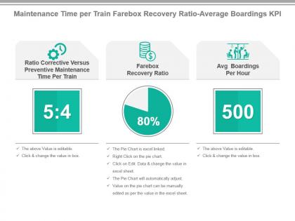 Maintenance time per train farebox recovery ratio average boardings kpi presentation slide
Presenting maintenance time per train farebox recovery ratio average boardings kpi presentation slide. This presentation slide shows Three Key Performance Indicators or KPIs in a Dashboard style design. The first KPI that can be shown is Ratio Corrective Versus Preventive Maintenance Time Per Train. The second KPI is Farebox Recovery Ratio. The third is Avg Boardings Per Hour. These KPI Powerpoint graphics are all data driven, and the shape automatically adjusts according to your data. Just right click on the KPI graphic, enter the right value and the shape will adjust automatically. Make a visual impact with our KPI slides.
-
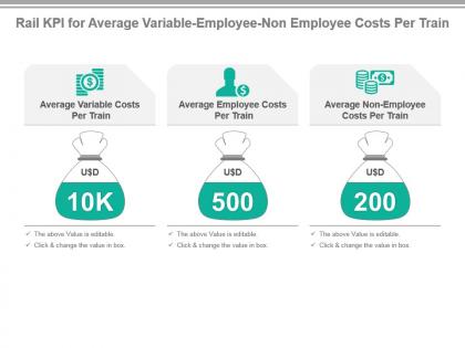 Rail kpi for average variable employee non employee costs per train ppt slide
Presenting rail kpi for average variable employee non employee costs per train ppt slide. This presentation slide shows Three Key Performance Indicators or KPIs in a Dashboard style design. The first KPI that can be shown is Average Variable Costs Per Train. The second KPI is Average Employee Costs Per Train. The third is Average Non Employee Costs Per Train. These KPI Powerpoint graphics are all data driven, and the shape automatically adjusts according to your data. Just right click on the KPI graphic, enter the right value and the shape will adjust automatically. Make a visual impact with our KPI slides.
-
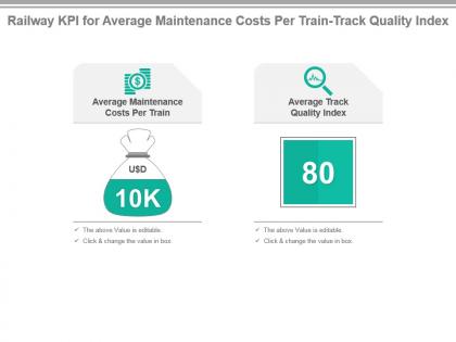 Railway kpi for average maintenance costs per train track quality index powerpoint slide
Presenting railway kpi for average maintenance costs per train track quality index powerpoint slide. This presentation slide shows Two Key Performance Indicators or KPIs in a Dashboard style design. The first KPI that can be shown is Average Maintenance Costs Per Train. The second KPI is Average Track Quality Index. These KPI Powerpoint graphics are all data driven, and the shape automatically adjusts according to your data. Just right click on the KPI graphic, enter the right value and the shape will adjust automatically. Make a visual impact with our KPI slides.
-
 Ratio fixed average corrective maintenance time variable costs kpi presentation slide
Presenting ratio fixed average corrective maintenance time variable costs kpi presentation slide. This presentation slide shows Three Key Performance Indicators or KPIs in a Dashboard style design. The first KPI that can be shown is Ratio Fixed Versus Variable Costs Per Truck. The second KPI is Average Corrective Maintenance Time Per Truck. The third is Average Variable Costs Per Truck. These KPI Powerpoint graphics are all data driven, and the shape automatically adjusts according to your data. Just right click on the KPI graphic, enter the right value and the shape will adjust automatically. Make a visual impact with our KPI slides.
-
 Airline kpi for average age of fleet fuel cost accidents per hour presentation slide
Presenting airline kpi for average age of fleet fuel cost accidents per hour presentation slide. This presentation slide shows three Key Performance Indicators or KPIs in a Dashboard style design. The first KPI that can be shown is Average Age of Fleet. The second KPI is Fuel Cost as Percentage of Total Costs and the third is Accidents Per 100,000 Flight Hours. These KPI Powerpoint graphics are all data driven, and the shape automatically adjusts according to your data. Just right click on the KPI graphic, enter the right value and the shape will adjust automatically. Make a visual impact with our KPI slides.
-
 Airline kpi for turnaround time average ticket prices freight revenue presentation slide
Presenting airline kpi for turnaround time average ticket prices freight revenue presentation slide. This presentation slide shows three Key Performance Indicators or KPIs in a Dashboard style design. The first KPI that can be shown is Turnaround Time. The second KPI is Average Ticket Prices and the third is Average Freight Revenue Per Ton Mile. These KPI Powerpoint graphics are all data driven, and the shape automatically adjusts according to your data. Just right click on the KPI graphic, enter the right value and the shape will adjust automatically. Make a visual impact with our KPI slides.
-
 Carrier kpi for average variable employee non employee costs presentation slide
Presenting carrier kpi for average variable employee non employee costs presentation slide. This presentation slide shows three Key Performance Indicators or KPIs in a Dashboard style design. The first KPI that can be shown is Average Variable Costs Per Airplane. The second KPI is Average Employee Costs Per Airplane and the third is Average Non Employee Costs Per Airplane. These KPI Powerpoint graphics are all data driven, and the shape automatically adjusts according to your data. Just right click on the KPI graphic, enter the right value and the shape will adjust automatically. Make a visual impact with our KPI slides.
-
 Flight kpi for traffic revenue available seats average stage length presentation slide
Presenting flight kpi for traffic revenue available seats average stage length presentation slide. This presentation slide shows three Key Performance Indicators or KPIs in a Dashboard style design. The first KPI that can be shown is percentage of Traffic Revenue. The second KPI is Available Seats Per Departure and the third is Average Stage Length. These KPI Powerpoint graphics are all data driven, and the shape automatically adjusts according to your data. Just right click on the KPI graphic, enter the right value and the shape will adjust automatically. Make a visual impact with our KPI slides.
-
 Kpi for average corrective preventive maintenance costs per truck powerpoint slide
Presenting kpi for average corrective preventive maintenance costs per truck powerpoint slide. This presentation slide shows two Key Performance Indicators or KPIs in a Dashboard style design. The first KPI that can be shown is Average Corrective Maintenance Costs Per Truck. The second KPI is Average Preventive Maintenance Costs Per Truck. These KPI Powerpoint graphics are all data driven, and the shape automatically adjusts according to your data. Just right click on the KPI graphic, enter the right value and the shape will adjust automatically. Make a visual impact with our KPI slides.
-
 Kpi for average direct costs corrective preventive maintenance costs ppt slide
Presenting kpi for average direct costs corrective preventive maintenance costs ppt slide. This presentation slide shows three Key Performance Indicators or KPIs in a Dashboard style design. The first KPI that can be shown is Average Direct Costs Per Train. The second KPI is Average Corrective Maintenance Costs Per Train and the third is Average Preventive Maintenance Costs Per Train. These KPI Powerpoint graphics are all data driven, and the shape automatically adjusts according to your data. Just right click on the KPI graphic, enter the right value and the shape will adjust automatically. Make a visual impact with our KPI slides.
-
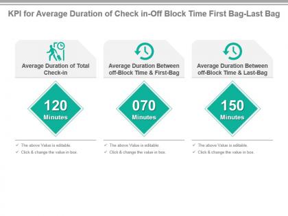 Kpi for average duration of check in off block time first bag last bag presentation slide
Presenting kpi for average duration of check in off block time first bag last bag presentation slide. This presentation slide shows three Key Performance Indicators or KPIs in a Dashboard style design. The first KPI that can be shown is Average Duration of Total Check in. The second KPI is Average Duration Between off Block Time And First Bag and the third is Average Duration Between off Block Time And Last Bag. These KPI Powerpoint graphics are all data driven, and the shape automatically adjusts according to your data. Just right click on the KPI graphic, enter the right value and the shape will adjust automatically. Make a visual impact with our KPI slides.
-
 Kpi for average immigration time weather delays check in counters powerpoint slide
Presenting kpi for average immigration time weather delays check in counters powerpoint slide. This presentation slide shows three Key Performance Indicators or KPIs in a Dashboard style design. The first KPI that can be shown is Average Immigration Time. The second KPI is Average Number of Weather Delays and the third is Average Number of Check in Counters Per Flight. These KPI Powerpoint graphics are all data driven, and the shape automatically adjusts according to your data. Just right click on the KPI graphic, enter the right value and the shape will adjust automatically. Make a visual impact with our KPI slides.
-
 Kpi for average maintenance costs maintenance time per truck ppt slide
Presenting kpi for average maintenance costs maintenance time per truck ppt slide. This presentation slide shows two Key Performance Indicators or KPIs in a Dashboard style design. The first KPI that can be shown is Average Maintenance Costs Per Truck. The second KPI is Average Maintenance Time Per Truck. These KPI Powerpoint graphics are all data driven, and the shape automatically adjusts according to your data. Just right click on the KPI graphic, enter the right value and the shape will adjust automatically. Make a visual impact with our KPI slides.
-
 Kpi for average maintenance costs time aircraft emissions presentation slide
Presenting kpi for average maintenance costs time aircraft emissions presentation slide. This presentation slide shows three Key Performance Indicators or KPIs in a Dashboard style design. The first KPI that can be shown is Average Maintenance Costs Per Airplane. The second KPI is Average Maintenance Time Per Airplane and the third is Aircraft Emissions Per Payload Capacity. These KPI Powerpoint graphics are all data driven, and the shape automatically adjusts according to your data. Just right click on the KPI graphic, enter the right value and the shape will adjust automatically. Make a visual impact with our KPI slides.
-
 Kpi for average time to deliver employee costs profit per delivery powerpoint slide
Presenting kpi for average time to deliver employee costs profit per delivery powerpoint slide. This presentation slide shows three Key Performance Indicators or KPIs in a Dashboard style design. The first KPI that can be shown is Average Time to Deliver. The second KPI is Employee Costs Per Delivery and the third is Profit Per Delivery. These KPI Powerpoint graphics are all data driven, and the shape automatically adjusts according to your data. Just right click on the KPI graphic, enter the right value and the shape will adjust automatically. Make a visual impact with our KPI slides.
-
 Kpi for fuel cost per trip average non employee direct costs per truck presentation slide
Presenting kpi for fuel cost per trip average non employee direct costs per truck presentation slide. This presentation slide shows three Key Performance Indicators or KPIs in a Dashboard style design. The first KPI that can be shown is Fuel Cost Per Trip. The second KPI is Average Non Employee Costs Per Truck and the third is Average Direct Costs Per Truck. These KPI Powerpoint graphics are all data driven, and the shape automatically adjusts according to your data. Just right click on the KPI graphic, enter the right value and the shape will adjust automatically. Make a visual impact with our KPI slides.
-
 Kpi for patient nights average number of nurses per patient presentation slide
Presenting kpi for patient nights average number of nurses per patient presentation slide. This presentation slide shows two Key Performance Indicators or KPIs in a Dashboard style design. The first KPI that can be shown is Patient Nights Per Nurse. The second KPI is Average Number of Nurse Patient Visits Per Patient. These KPI Powerpoint graphics are all data driven, and the shape automatically adjusts according to your data. Just right click on the KPI graphic, enter the right value and the shape will adjust automatically. Make a visual impact with our KPI slides.
-
 Kpi for profit average employee costs dentist time per treatment powerpoint slide
Presenting kpi for profit average employee costs dentist time per treatment powerpoint slide. This presentation slide shows three Key Performance Indicators or KPIs in a Dashboard style design. The first KPI that can be shown is Profit Per Dentist Treatment. The second KPI is Average Employee Costs Per Dentist Treatment and the third is Average Dentist Time Per Dentist Treatment. These KPI Powerpoint graphics are all data driven, and the shape automatically adjusts according to your data. Just right click on the KPI graphic, enter the right value and the shape will adjust automatically. Make a visual impact with our KPI slides.
-
 Medical kpi for average total fixed variable costs per hospital bed powerpoint slide
Presenting medical kpi for average total fixed variable costs per hospital bed powerpoint slide. This presentation slide shows three Key Performance Indicators or KPIs in a Dashboard style design. The first KPI that can be shown is Average Total Costs Per Hospital Bed. The second KPI is Average Total Fixed Costs Per Hospital Bed and the third is Average Total Variable Costs Per Hospital Bed. These KPI Powerpoint graphics are all data driven, and the shape automatically adjusts according to your data. Just right click on the KPI graphic, enter the right value and the shape will adjust automatically. Make a visual impact with our KPI slides.
-
 Nursing kpi for patient time average nurse per patient total visits presentation slide
Presenting nursing kpi for patient time average nurse per patient total visits presentation slide. This presentation slide shows three Key Performance Indicators or KPIs in a Dashboard style design. The first KPI that can be shown is Total Nurse Patient Facing Time. The second KPI is Average Nurse Patient Facing Time Per Patient and the third is Total Number of Nurse Patient Visits. These KPI Powerpoint graphics are all data driven, and the shape automatically adjusts according to your data. Just right click on the KPI graphic, enter the right value and the shape will adjust automatically. Make a visual impact with our KPI slides.
-
 Radiology kpi for average number of x rays average cost per x ray presentation slide
Presenting radiology kpi for average number of x rays average cost per x ray presentation slide. This presentation slide shows two Key Performance Indicators or KPIs in a Dashboard style design. The first KPI that can be shown is Average Number of X rays. The second KPI is Average Cost Per X ray. These KPI Powerpoint graphics are all data driven, and the shape automatically adjusts according to your data. Just right click on the KPI graphic, enter the right value and the shape will adjust automatically. Make a visual impact with our KPI slides.
-
 Dentist kpi for average total costs fixed costs occupation time presentation slide
Presenting dentist kpi for average total costs fixed costs occupation time presentation slide. This presentation slide shows three Key Performance Indicators or KPIs in a Dashboard style design. The first KPI that can be shown is Average Total Costs Per Dentist Treatment. The second KPI is Average Fixed Costs Per Dentist Treatment and the third is Dentist Chair Occupation Time percentage. These KPI Powerpoint graphics are all data driven, and the shape automatically adjusts according to your data. Just right click on the KPI graphic, enter the right value and the shape will adjust automatically. Make a visual impact with our KPI slides.
-
 Hospital kpi for average employee costs profit delayed discharges powerpoint slide
Presenting hospital kpi for average employee costs profit delayed discharges powerpoint slide. This presentation slide shows three Key Performance Indicators or KPIs in a Dashboard style design. The first KPI that can be shown is Average Employee Costs Per Hospital Bed. The second KPI is Profit Per Hospital Bed and the third is percentage of Delayed Discharges. These KPI Powerpoint graphics are all data driven, and the shape automatically adjusts according to your data. Just right click on the KPI graphic, enter the right value and the shape will adjust automatically. Make a visual impact with our KPI slides.
-
 Hospital kpi for average occupation discharge time patient stay time ppt slide
Presenting hospital kpi for average occupation discharge time patient stay time ppt slide. This presentation slide shows three Key Performance Indicators or KPIs in a Dashboard style design. The first KPI that can be shown is Average Occupation Time of Hospital Bed. The second KPI is Average Discharge Time of Patient and the third is Average Length of Stay for Patients. These KPI Powerpoint graphics are all data driven, and the shape automatically adjusts according to your data. Just right click on the KPI graphic, enter the right value and the shape will adjust automatically. Make a visual impact with our KPI slides.
-
 Kpi for average employee non employee costs ratio cost per test ppt slide
Presenting kpi for average employee non employee costs ratio cost per test ppt slide. This presentation slide shows three Key Performance Indicators or KPIs in a Dashboard style design. The first KPI that can be shown is Average Employee Costs Per Laboratory Test. The second KPI is Average Non Employee Costs Per Laboratory Test and the third is Ratio Employee Costs Versus Non Employee Costs Per Laboratory Test. These KPI Powerpoint graphics are all data driven, and the shape automatically adjusts according to your data. Just right click on the KPI graphic, enter the right value and the shape will adjust automatically. Make a visual impact with our KPI slides.
-
 Kpi for average x ray consultation time percentage of emergency x rays presentation slide
Presenting kpi for average x ray consultation time percentage of emergency x rays presentation slide. This presentation slide shows two Key Performance Indicators or KPIs in a Dashboard style design. The first KPI that can be shown is Average Time of X ray Consultation. The second KPI is percentage of Emergency X rays. These KPI Powerpoint graphics are all data driven, and the shape automatically adjusts according to your data. Just right click on the KPI graphic, enter the right value and the shape will adjust automatically. Make a visual impact with our KPI slides.
-
 Kpi for number of chairs average total costs fixed costs per dentist presentation slide
Presenting kpi for number of chairs average total costs fixed costs per dentist presentation slide. This presentation slide shows three Key Performance Indicators or KPIs in a Dashboard style design. The first KPI that can be shown is Number of Chairs Per Dentist. The second KPI is Average Total Costs Per Dentist Chair and the third is Average Fixed Costs Per Dentist Chair. These KPI Powerpoint graphics are all data driven, and the shape automatically adjusts according to your data. Just right click on the KPI graphic, enter the right value and the shape will adjust automatically. Make a visual impact with our KPI slides.
-
 Inventory kpi for average age supply months ppt slide
Presenting inventory kpi for average age supply months ppt slide. This presentation slide shows Two Key Performance Indicators or KPIs. The first KPI that can be show is Average Age of Inventory. The second KPI is Inventory Months of Supply. These KPI Powerpoint graphics are all data driven, and the shape automatically adjusts according to your data. Just right click on the KPI graphic, enter the right value and the shape will adjust automatically. Make a visual impact with our KPI slides.
-
 Kpi for average handling cost in order fulfillment powerpoint slide
Presenting kpi for average handling cost in order fulfillment powerpoint slide. This presentation slide shows two Key Performance Indicators or KPIs. The first KPI that can be show is Average Number of Days Open of Orders. The second KPI is Average Handling Cost Per Order. These KPI Powerpoint graphics are all data driven, and the shape automatically adjusts according to your data. Just right click on the KPI graphic, enter the right value and the shape will adjust automatically. Make a visual impact with our KPI slides.
-
 Kpi for inventory replenishment cycle time average unit cost presentation slide
Presenting kpi for inventory replenishment cycle time average unit cost presentation slide. This presentation slide shows two Key Performance Indicators or KPIs in a Dashboard style design. The first KPI that can be shown is Inventory Replenishment Cycle Time. The second KPI is Average Unit Cost. These KPI Powerpoint graphics are all data driven, and the shape automatically adjusts according to your data. Just right click on the KPI graphic, enter the right value and the shape will adjust automatically. Make a visual impact with our KPI slides.
-
 Financial performance kpi dashboard showing sales growth average purchase value
Presenting this set of slides with name - Financial Performance Kpi Dashboard Showing Sales Growth Average Purchase Value. This is a three stage process. The stages in this process are Financial Performance, Financial Report, Financial Review.
-
 Marketing kpi dashboard showing bounce rate average session duration
Presenting this set of slides with name - Marketing Kpi Dashboard Showing Bounce Rate Average Session Duration. This is a three stage process. The stages in this process are Marketing, Branding, Promoting.
-
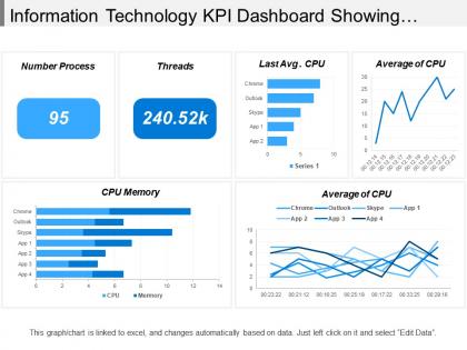 Information technology kpi dashboard showing cpu memory average of cpu
Presenting this set of slides with name - Information Technology Kpi Dashboard Showing Cpu Memory Average Of Cpu. This is a six stage process. The stages in this process are Information Technology, It, Iot.
-
 Mining oil and gas extraction kpi dashboard showing average production costs and energy consumption
Presenting this set of slides with name - Mining Oil And Gas Extraction Kpi Dashboard Showing Average Production Costs And Energy Consumption. This is a four stage process. The stages in this process are Mining, Oil And Gas Extraction, Refinery, Natural Gas.
-
 Audit kpi dashboard showing lead time average entry variance and amount contribution
Presenting this set of slides with name - Audit Kpi Dashboard Showing Lead Time Average Entry Variance And Amount Contribution. This is a four stage process. The stages in this process are Audit, Examine, Survey.
-
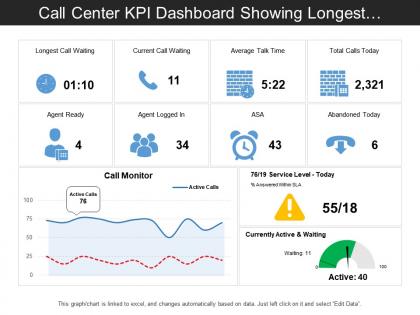 Call center kpi dashboard showing longest call waiting and average talk time
Presenting this set of slides with name - Call Center Kpi Dashboard Showing Longest Call Waiting And Average Talk Time. This is a three stage process. The stages in this process are Call Center Agent, Customer Care, Client Support.
-
 Call center kpi dashboard showing total calls average answer speed abandon rate
Presenting this set of slides with name - Call Center Kpi Dashboard Showing Total Calls Average Answer Speed Abandon Rate. This is a five stage process. The stages in this process are Call Center Agent, Customer Care, Client Support.
-
 Maintenance kpi dashboard showing average maintenance costs
Presenting this set of slides with name - Maintenance Kpi Dashboard Showing Average Maintenance Costs. This is a one stage process. The stages in this process are Maintenance, Preservation, Conservation.
-
 Business Kpi Dashboard Showing Average Revenue And Clv
Presenting this set of slides with name - Business Kpi Dashboard Showing Average Revenue And Clv. This is a three stage process. The stages in this process are Business Dashboard, Business Kpi, Business Performance.
-
 Team utilization average allocation weekly team utilization
Presenting this set of slides with name - Team Utilization Average Allocation Weekly Team Utilization. This is a six stage process. The stages in this process are Team Utilization, Team Employment, Team Usage.
-
 Hr dashboard total salary average salary
Presenting this set of slides with name - Hr Dashboard Total Salary Average Salary. This is a three stage process. The stages in this process are Hr Dashboard, Human Resource Dashboard, Hr Kpi.
-
 Agriculture and forestry kpi dashboard showing average milk yield per lactation
Exhibiting agriculture and forestry KPI dashboard showing average milk yield per lactation PPT design. Speedy download with easy to save options. Effortless to put in corporation name, logo and image. Presentation template can be shared with Google slides as easily merge with them. PowerPoint graphic can be showcased in standard and widescreen view. Preference to download and present with different nodes and stages. PPT diagram can be modify easily as some components are editable.
-
 Environmental sustainability kpi dashboard showing corporate average data efficiency
Presenting this set of slides with name - Environmental Sustainability Kpi Dashboard Showing Corporate Average Data Efficiency. This is a four stage process. The stages in this process are Environment Sustainability, Environment Continual, Environment Feasibility.
-
 Wholesale and retail kpi dashboard showing average transaction size and customer retention
Presenting this set of slides with name - Wholesale And Retail Kpi Dashboard Showing Average Transaction Size And Customer Retention. This is a four stage process. The stages in this process are Wholesale And Retail, Extensive And Retail, Wholesale And Distribute.
-
 Entertainment recreation and arts kpi dashboard average annual expenditure and time spent
Presenting this set of slides with name - Entertainment Recreation And Arts Kpi Dashboard Average Annual Expenditure And Time Spent. This is a three stage process. The stages in this process are Entertainment, Recreation And Arts, Attractions, Culture, Entertainment.
-
 Workforce kpi dashboard showing average age female percentage and average tenure
Presenting this set of slides with name - Workforce Kpi Dashboard Showing Average Age Female Percentage And Average Tenure. This is a four stage process. The stages in this process are Staff, Personnel, Workforce.
-
 Workforce kpi dashboard showing staff split by gender and average tenure by department
Presenting this set of slides with name - Workforce Kpi Dashboard Showing Staff Split By Gender And Average Tenure By Department. This is a six stage process. The stages in this process are Staff, Personnel, Workforce.
-
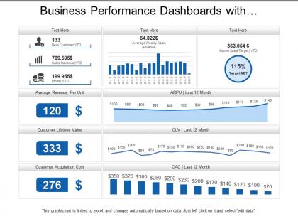 Business performance dashboards with average revenue and customer lifetime value
Presenting, our business performance dashboards with average revenue and customer lifetime value PPT template. You can download this engaging PPT template and take a report of the full version of this PPT deck which includes editing the text, adjusting the colors according to your liking, watermark gets expelled, include your company's logo and get slides in widescreen version.
-
 Average absenteeism rate recruitment dashboard
Presenting this set of slides with name - Average Absenteeism Rate Recruitment Dashboard. This is a six stage process. The stages in this process are Staffing Plan, Recruitment, Staff Management.


