KPI Dashboard, Excel and Metrics PPT Templates
-
 Kpi for organic search brand index keyword visibility ratio powerpoint slide
Presenting kpi for organic search brand index keyword visibility ratio powerpoint slide. This presentation slide shows Three Key Performance Indicators or KPIs in a Dashboard style design. The first KPI that can be shown is Percentage of Leads Generated Via Organic Search SEO. The second KPI is Percentage of Visits From Searches Corresponding to Brand Name Brand Index. The third is Search Engine Keyword Visibility Ratio. These KPI Powerpoint graphics are all data driven, and the shape automatically adjusts according to your data. Just right click on the KPI graphic, enter the right value and the shape will adjust automatically. Make a visual impact with our KPI slides.
-
 Search engine optimization kpi for keywords per page yield deep links ppt slide
Presenting search engine optimization kpi for keywords per page yield deep links ppt slide. This presentation slide shows Two Key Performance Indicators or KPIs in a Dashboard style design. The first KPI that can be shown is Keywords Per Page Yield. The second KPI is Percentage of Google Backlinks Deep Links. These KPI Powerpoint graphics are all data driven, and the shape automatically adjusts according to your data. Just right click on the KPI graphic, enter the right value and the shape will adjust automatically. Make a visual impact with our KPI slides.
-
 Seo kpi for index to crawl ratios natural traffic per keyword presentation slide
Presenting seo kpi for index to crawl ratios natural traffic per keyword presentation slide. This presentation slide shows Two Key Performance Indicators or KPIs in a Dashboard style design. The first KPI that can be shown is Index to Crawl Ratios. The second KPI is Natural Traffic Per Keyword. These KPI Powerpoint graphics are all data driven, and the shape automatically adjusts according to your data. Just right click on the KPI graphic, enter the right value and the shape will adjust automatically. Make a visual impact with our KPI slides.
-
 Seo kpi for organic search indexed pages google backlinks powerpoint slide
Presenting seo kpi for organic search indexed pages google backlinks powerpoint slide. This presentation slide shows Three Key Performance Indicators or KPIs in a Dashboard style design. The first KPI that can be shown is Percentage of Sales Generated Via Organic Search. The second KPI is Number of Indexed Pages. The third is Percentage of Google Backlinks Deep Links. These KPI Powerpoint graphics are all data driven, and the shape automatically adjusts according to your data. Just right click on the KPI graphic, enter the right value and the shape will adjust automatically. Make a visual impact with our KPI slides.
-
 Analytics kpi for average group members groups joined user comments powerpoint slide
Presenting analytics kpi for average group members groups joined user comments powerpoint slide. This presentation slide shows three Key Performance Indicators or KPIs in a Dashboard style design. The first KPI that can be shown is Average Number of Group Members. The second KPI is Average Number of Groups That Member Joined and the third is Average Comments User. These KPI Powerpoint graphics are all data driven, and the shape automatically adjusts according to your data. Just right click on the KPI graphic, enter the right value and the shape will adjust automatically. Make a visual impact with our KPI slides.
-
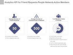 Analytics kpi for friend requests people network active members ppt slide
Presenting analytics kpi for friend requests people network active members ppt slide. This presentation slide shows three Key Performance Indicators or KPIs in a Dashboard style design. The first KPI that can be shown is Average Number of Friend Requests. The second KPI is Average Number of Friends People in Network and the third is percentage of Members Active in Groups. These KPI Powerpoint graphics are all data driven, and the shape automatically adjusts according to your data. Just right click on the KPI graphic, enter the right value and the shape will adjust automatically. Make a visual impact with our KPI slides.
-
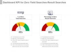 Dashboard Snapshot kpi for zero yield searches result searches presentation slide
Presenting dashboard snapshot kpi for zero yield searches result searches presentation slide. This presentation slide shows two Key Performance Indicators or KPIs in a Dashboard style design. The first KPI that can be shown is Percentage of Zero Yield Searches. The second KPI is Percentage of Zero Result Searches. These KPI Powerpoint graphics are all data driven, and the shape automatically adjusts according to your data. Just right click on the KPI graphic, enter the right value and the shape will adjust automatically. Make a visual impact with our KPI slides.
-
 E metrics kpi for average user website time conversion rate powerpoint slide
Presenting e metrics kpi for average user website time conversion rate powerpoint slide. This presentation slide shows two Key Performance Indicators or KPIs in a Dashboard style design. The first KPI that can be shown is Average Time on Website. The second KPI is Conversion Rate. These KPI Powerpoint graphics are all data driven, and the shape automatically adjusts according to your data. Just right click on the KPI graphic, enter the right value and the shape will adjust automatically. Make a visual impact with our KPI slides.
-
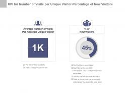 Kpi for number of visits per unique visitor percentage of new visitors ppt slide
Presenting kpi for number of visits per unique visitor percentage of new visitors ppt slide. This presentation slide shows two Key Performance Indicators or KPIs in a Dashboard style design. The first KPI that can be shown is Average Number of Visits Per Absolute Unique Visitor. The second KPI is Percentage of New Visitors. These KPI Powerpoint graphics are all data driven, and the shape automatically adjusts according to your data. Just right click on the KPI graphic, enter the right value and the shape will adjust automatically. Make a visual impact with our KPI slides.
-
 Kpi for revenue from organic search online ads website visitors presentation slide
Presenting kpi for revenue from organic search online ads website visitors presentation slide. This presentation slide shows three Key Performance Indicators or KPIs in a Dashboard style design. The first KPI that can be shown is Revenue From Organic Search Engine Traffic. The second KPI is Revenue From Online Ads and the third is Revenue Per Visit. These KPI Powerpoint graphics are all data driven, and the shape automatically adjusts according to your data. Just right click on the KPI graphic, enter the right value and the shape will adjust automatically. Make a visual impact with our KPI slides.
-
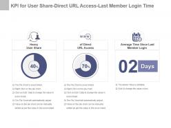 Kpi for user share direct url access last member login time powerpoint slide
Presenting kpi for user share direct url access last member login time powerpoint slide. This presentation slide shows three Key Performance Indicators or KPIs in a Dashboard style design. The first KPI that can be shown is Heavy User Share. The second KPI is of Direct URL Access and the third is Average Time Since Last Member Login. These KPI Powerpoint graphics are all data driven, and the shape automatically adjusts according to your data. Just right click on the KPI graphic, enter the right value and the shape will adjust automatically. Make a visual impact with our KPI slides.
-
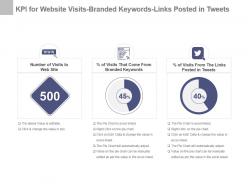 Kpi for website visits branded keywords links posted in tweets ppt slide
Presenting kpi for website visits branded keywords links posted in tweets ppt slide. This presentation slide shows three Key Performance Indicators or KPIs in a Dashboard style design. The first KPI that can be shown is Number of Visits to Web Site. The second KPI is Percentage of Visits That Come From Branded Keywords and the third is Percentage of Visits From The Links Posted in Tweets. These KPI Powerpoint graphics are all data driven, and the shape automatically adjusts according to your data. Just right click on the KPI graphic, enter the right value and the shape will adjust automatically. Make a visual impact with our KPI slides.
-
 Number of back links website success rate page reviews kpi presentation slide
Presenting number of back links website success rate page reviews kpi presentation slide. This presentation slide shows three Key Performance Indicators or KPIs in a Dashboard style design. The first KPI that can be shown is Total Number of Incoming Back Links. The second KPI is Website Success Rate and the third is Number of Page Views. These KPI Powerpoint graphics are all data driven, and the shape automatically adjusts according to your data. Just right click on the KPI graphic, enter the right value and the shape will adjust automatically. Make a visual impact with our KPI slides.
-
 Percentage dashboard snapshot kpi for canceled checkouts bounce rate powerpoint slide
Presenting percentage dashboard snapshot kpi for canceled checkouts bounce rate powerpoint slide. This presentation slide shows two Key Performance Indicators or KPIs in a Dashboard style design. The first KPI that can be shown is Percentage of Canceled Checkouts. The second KPI is Bounce Rate. These KPI Powerpoint graphics are all data driven, and the shape automatically adjusts according to your data. Just right click on the KPI graphic, enter the right value and the shape will adjust automatically. Make a visual impact with our KPI slides.
-
 Site analysis kpi for referral rss subscribers members website spent time ppt slide
Presenting site analysis kpi for referral rss subscribers members website spent time ppt slide. This presentation slide shows three Key Performance Indicators or KPIs in a Dashboard style design. The first KPI that can be shown is Referral Percentage. The second KPI is Number of RSS Subscribers and the third is Total Time Spent on Web Site By Members. These KPI Powerpoint graphics are all data driven, and the shape automatically adjusts according to your data. Just right click on the KPI graphic, enter the right value and the shape will adjust automatically. Make a visual impact with our KPI slides.
-
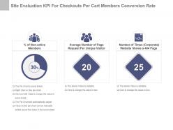 Site evaluation kpi for checkouts per cart members conversion rate presentation slide
Presenting site evaluation kpi for checkouts per cart members conversion rate presentation slide. This presentation slide shows three Key Performance Indicators or KPIs in a Dashboard style design. The first KPI that can be shown is Percentage of Non active Members. The second KPI is Average Number of Page Request Per Unique Visitor and the third is Number of Times Corporate Website Shows a 404 Page. These KPI Powerpoint graphics are all data driven, and the shape automatically adjusts according to your data. Just right click on the KPI graphic, enter the right value and the shape will adjust automatically. Make a visual impact with our KPI slides.
-
 Site review kpi for non active members page request 404 page time powerpoint slide
Presenting site review kpi for non active members page request 404 page time powerpoint slide. This presentation slide shows two Key Performance Indicators or KPIs in a Dashboard style design. The first KPI that can be shown is Checkouts Per Cart. The second KPI is Anonymous Visitors to Members Conversion Rate. These KPI Powerpoint graphics are all data driven, and the shape automatically adjusts according to your data. Just right click on the KPI graphic, enter the right value and the shape will adjust automatically. Make a visual impact with our KPI slides.
-
 Web analytics kpi for number percentage of returning visitors ppt slide
Presenting web analytics kpi for number percentage of returning visitors ppt slide. This presentation slide shows two Key Performance Indicators or KPIs in a Dashboard style design. The first KPI that can be shown is Number of Returning Visitors. The second KPI is Percentage of Returning Visitors. These KPI Powerpoint graphics are all data driven, and the shape automatically adjusts according to your data. Just right click on the KPI graphic, enter the right value and the shape will adjust automatically. Make a visual impact with our KPI slides.
-
 Web analytics kpi for page views page request single access pages presentation slide
Presenting web analytics kpi for page views page request single access pages presentation slide. This presentation slide shows three Key Performance Indicators or KPIs in a Dashboard style design. The first KPI that can be shown is Average Number of Page Views Per Visitor Session. The second KPI is Average Number of Page Request Per Visitor and the third is Number of Single Access Pages. These KPI Powerpoint graphics are all data driven, and the shape automatically adjusts according to your data. Just right click on the KPI graphic, enter the right value and the shape will adjust automatically. Make a visual impact with our KPI slides.
-
 Web management kpi for onsite search sessions number of searches powerpoint slide
Presenting web management kpi for onsite search sessions number of searches powerpoint slide. This presentation slide shows two Key Performance Indicators or KPIs in a Dashboard style design. The first KPI that can be shown is On Site Search Sessions Percentage. The second KPI is Number of Searches. These KPI Powerpoint graphics are all data driven, and the shape automatically adjusts according to your data. Just right click on the KPI graphic, enter the right value and the shape will adjust automatically. Make a visual impact with our KPI slides.
-
 Website visitors key performance indicators report ppt slide
Presenting website visitors key performance indicators report ppt slide. This presentation slide shows three Key Performance Indicators or KPIs in a Dashboard style design. The first KPI that can be shown is Number of Visitors of Web Site. The second KPI is Number of Unique Visitors of Web Site and the third is Average Time Spent on Website For Member. These KPI Powerpoint graphics are all data driven, and the shape automatically adjusts according to your data. Just right click on the KPI graphic, enter the right value and the shape will adjust automatically. Make a visual impact with our KPI slides.
-
 Cargo kpi for direct cost corrective preventive maintenance per ship powerpoint slide
Presenting cargo kpi for direct cost corrective preventive maintenance per ship powerpoint slide. This presentation slide shows three Key Performance Indicators or KPIs in a Dashboard style design. The first KPI that can be shown is Average Direct Costs Per Ship. The second KPI is Average Corrective Maintenance Costs Per Ship and the third is Average Preventive Maintenance Costs Per Ship. These KPI Powerpoint graphics are all data driven, and the shape automatically adjusts according to your data. Just right click on the KPI graphic, enter the right value and the shape will adjust automatically. Make a visual impact with our KPI slides.
-
 Carriage kpi for throughput damages olf undamaged goods after shipping ppt slide
Presenting carriage kpi for throughput damages olf undamaged goods after shipping ppt slide. This presentation slide shows three Key Performance Indicators or KPIs in a Dashboard style design. The first KPI that can be shown is Damages as percentage of Throughput. The second KPI is Optimize Load Fulfilment OLF percentage and the third is percentage of Undamaged Goods After Shipping Transportation. These KPI Powerpoint graphics are all data driven, and the shape automatically adjusts according to your data. Just right click on the KPI graphic, enter the right value and the shape will adjust automatically. Make a visual impact with our KPI slides.
-
 Carrying kpi for agreed delivery time free orders cost fuel per package presentation slide
Presenting carrying kpi for agreed delivery time free orders cost fuel per package presentation slide. This presentation slide shows three Key Performance Indicators or KPIs in a Dashboard style design. The first KPI that can be shown is percentage of Agreed Delivery Times Reached. The second KPI is percentage of Free Orders Delivered Cost and the third is Amount of Fuel Per Package. These KPI Powerpoint graphics are all data driven, and the shape automatically adjusts according to your data. Just right click on the KPI graphic, enter the right value and the shape will adjust automatically. Make a visual impact with our KPI slides.
-
 Delivery kpi for outbound transportation utilization of trailers act powerpoint slide
Presenting delivery kpi for outbound transportation utilization of trailers act powerpoint slide. This presentation slide shows three Key Performance Indicators or KPIs in a Dashboard style design. The first KPI that can be shown is Total Number of Outbound Transportation Kilograms. The second KPI is Ultisation of Trailers and the third is Available Cargo Tonne ACT. These KPI Powerpoint graphics are all data driven, and the shape automatically adjusts according to your data. Just right click on the KPI graphic, enter the right value and the shape will adjust automatically. Make a visual impact with our KPI slides.
-
 Fleet average per vehicle tonnage moved fuel costs transportation kpi ppt slide
Presenting fleet average per vehicle tonnage moved fuel costs transportation kpi ppt slide. This presentation slide shows three Key Performance Indicators or KPIs in a Dashboard style design. The first KPI that can be shown is Fleet Average Per Vehicle Emission of Greenhouse Gases. The second KPI is Tonnage Moved and the third is Fuel Costs Ton Km. These KPI Powerpoint graphics are all data driven, and the shape automatically adjusts according to your data. Just right click on the KPI graphic, enter the right value and the shape will adjust automatically. Make a visual impact with our KPI slides.
-
 Freight kpi for accessorials claims outbound transportation costs presentation slide
Presenting freight kpi for accessorials claims outbound transportation costs presentation slide. This presentation slide shows three Key Performance Indicators or KPIs in a Dashboard style design. The first KPI that can be shown is Accessorials as Percent of Total Freight. The second KPI is Claims as percentage of Freight Costs and the third is Outbound Transportation Costs Kilogram. These KPI Powerpoint graphics are all data driven, and the shape automatically adjusts according to your data. Just right click on the KPI graphic, enter the right value and the shape will adjust automatically. Make a visual impact with our KPI slides.
-
 Freight kpi for net tonne kilometer shipment lead time accuracy powerpoint slide
Presenting freight kpi for net tonne kilometer shipment lead time accuracy powerpoint slide. This presentation slide shows two Key Performance Indicators or KPIs in a Dashboard style design. The first KPI that can be shown is Net Tonne Kilometer NTKM. The second KPI is Shipment Lead Time Accuracy. These KPI Powerpoint graphics are all data driven, and the shape automatically adjusts according to your data. Just right click on the KPI graphic, enter the right value and the shape will adjust automatically. Make a visual impact with our KPI slides.
-
 Kpi for average crew per ship c02e nox emissions per 1000 miles ppt slide
Presenting kpi for average crew per ship c02e nox emissions per 1000 miles ppt slide. This presentation slide shows three Key Performance Indicators or KPIs in a Dashboard style design. The first KPI that can be shown is Average Number of Crew Per Ship. The second KPI is CO2e Emissions Per 1000 Revenue Ton Mile and the third is Nox Emissions Per 1000 Revenue Ton Miles. These KPI Powerpoint graphics are all data driven, and the shape automatically adjusts according to your data. Just right click on the KPI graphic, enter the right value and the shape will adjust automatically. Make a visual impact with our KPI slides.
-
 Kpi for freight revenue stops per trip orders arrived at right location presentation slide
Presenting kpi for freight revenue stops per trip orders arrived at right location presentation slide. This presentation slide shows three Key Performance Indicators or KPIs in a Dashboard style design. The first KPI that can be shown is Average Freight Revenue Per Ton Mile. The second KPI is Average Number of Stops Per Trip and the third is percentage of Orders Items Arrives at the Right Location. These KPI Powerpoint graphics are all data driven, and the shape automatically adjusts according to your data. Just right click on the KPI graphic, enter the right value and the shape will adjust automatically. Make a visual impact with our KPI slides.
-
 Kpi for fuel cost crew retention trailer fill percentage powerpoint slide
Presenting kpi for fuel cost crew retention trailer fill percentage powerpoint slide. This presentation slide shows three Key Performance Indicators or KPIs in a Dashboard style design. The first KPI that can be shown is Fuel Cost as percentage of Total Costs. The second KPI is Crew Retention percentage of Returned Crew and the third is Trailer fill percentage. These KPI Powerpoint graphics are all data driven, and the shape automatically adjusts according to your data. Just right click on the KPI graphic, enter the right value and the shape will adjust automatically. Make a visual impact with our KPI slides.
-
 Kpi for greenhouse gases emitted consignment size service quality ppt slide
Presenting kpi for greenhouse gases emitted consignment size service quality ppt slide. This presentation slide shows three Key Performance Indicators or KPIs in a Dashboard style design. The first KPI that can be shown is Greenhouse Gases Emitted Per Mile Traveled. The second KPI is Average Consignment Size and the third is Transportation Quality of Service. These KPI Powerpoint graphics are all data driven, and the shape automatically adjusts according to your data. Just right click on the KPI graphic, enter the right value and the shape will adjust automatically. Make a visual impact with our KPI slides.
-
 Kpi for import export cost fuel usage outbound transportation cost presentation slide
Presenting kpi for import export cost fuel usage outbound transportation cost presentation slide. This presentation slide shows three Key Performance Indicators or KPIs in a Dashboard style design. The first KPI that can be shown is Average Cost Involved With Import or Export Transaction. The second KPI is Fuel Usage Ton Km and the third is Total Outbound Transportation Cost. These KPI Powerpoint graphics are all data driven, and the shape automatically adjusts according to your data. Just right click on the KPI graphic, enter the right value and the shape will adjust automatically. Make a visual impact with our KPI slides.
-
 Kpi for marpol violations navigational incidents water discharge damages powerpoint slide
Presenting kpi for marpol violations navigational incidents water discharge damages powerpoint slide. This presentation slide shows three Key Performance Indicators or KPIs in a Dashboard style design. The first KPI that can be shown is Number of Marpol Violations. The second KPI is Number of Navigational Incidents and the third is Ballast Water Discharge Violations. These KPI Powerpoint graphics are all data driven, and the shape automatically adjusts according to your data. Just right click on the KPI graphic, enter the right value and the shape will adjust automatically. Make a visual impact with our KPI slides.
-
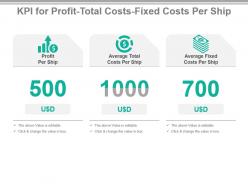 Kpi for profit total costs fixed costs per ship ppt slide
Presenting kpi for profit total costs fixed costs per ship ppt slide. This presentation slide shows three Key Performance Indicators or KPIs in a Dashboard style design. The first KPI that can be shown is Profit Per Ship. The second KPI is Average Total Costs Per Ship and the third is Average Fixed Costs Per Ship. These KPI Powerpoint graphics are all data driven, and the shape automatically adjusts according to your data. Just right click on the KPI graphic, enter the right value and the shape will adjust automatically. Make a visual impact with our KPI slides.
-
 Kpi for ratio fixed variable direct indirect corrective preventive costs presentation slide
Presenting kpi for ratio fixed variable direct indirect corrective preventive costs presentation slide. This presentation slide shows three Key Performance Indicators or KPIs in a Dashboard style design. The first KPI that can be shown is Ratio Fixed Versus Variable Costs Per Ship. The second KPI is Ratio Direct Versus Indirect Costs Per Ship and the third is Ratio Corrective Versus Preventive Maintenance Costs Per Ship. These KPI Powerpoint graphics are all data driven, and the shape automatically adjusts according to your data. Just right click on the KPI graphic, enter the right value and the shape will adjust automatically. Make a visual impact with our KPI slides.
-
 Kpi for ship maintenance time injured passengers handling operations powerpoint slide
Presenting kpi for ship maintenance time injured passengers handling operations powerpoint slide. This presentation slide shows two Key Performance Indicators or KPIs in a Dashboard style design. The first KPI that can be shown is Time of Ship Maintenance Vs Charter Time. The second KPI is percentage of Injured Passengers During Passenger Handling Operations. These KPI Powerpoint graphics are all data driven, and the shape automatically adjusts according to your data. Just right click on the KPI graphic, enter the right value and the shape will adjust automatically. Make a visual impact with our KPI slides.
-
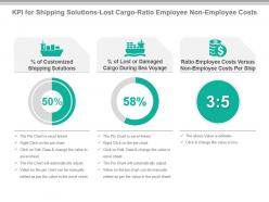 Kpi for shipping solutions lost cargo ratio employee non employee costs ppt slide
Presenting kpi for shipping solutions lost cargo ratio employee non employee costs ppt slide. This presentation slide shows three Key Performance Indicators or KPIs in a Dashboard style design. The first KPI that can be shown is percentage of Customized Shipping Solutions. The second KPI is percentage of Lost or Damaged Cargo During Sea Voyage and the third is Ratio Employee Costs Versus Non Employee Costs Per Ship. These KPI Powerpoint graphics are all data driven, and the shape automatically adjusts according to your data. Just right click on the KPI graphic, enter the right value and the shape will adjust automatically. Make a visual impact with our KPI slides.
-
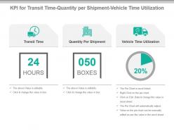 Kpi for transit time quantity per shipment vehicle time utilization presentation slide
Presenting kpi for transit time quantity per shipment vehicle time utilization presentation slide. This presentation slide shows three Key Performance Indicators or KPIs in a Dashboard style design. The first KPI that can be shown is Transit Time. The second KPI is Quantity Per Shipment and the third is Vehicle Time Utilization. These KPI Powerpoint graphics are all data driven, and the shape automatically adjusts according to your data. Just right click on the KPI graphic, enter the right value and the shape will adjust automatically. Make a visual impact with our KPI slides.
-
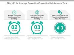 Ship kpi for average corrective preventive maintenance time powerpoint slide
Presenting ship kpi for average corrective preventive maintenance time powerpoint slide. This presentation slide shows three Key Performance Indicators or KPIs in a Dashboard style design. The first KPI that can be shown is Average Corrective Maintenance Time Per Ship. The second KPI is Average Preventive Maintenance Time Per Ship and the third is Ratio Corrective Versus Preventive Maintenance Time Per Ship. These KPI Powerpoint graphics are all data driven, and the shape automatically adjusts according to your data. Just right click on the KPI graphic, enter the right value and the shape will adjust automatically. Make a visual impact with our KPI slides.
-
 Ship kpi for injured passengers new cadets assigned to vessels ppt slide
Presenting ship kpi for injured passengers new cadets assigned to vessels ppt slide. This presentation slide shows two Key Performance Indicators or KPIs in a Dashboard style design. The first KPI that can be shown is percentage of Injured Passengers During Sea Voyage. The second KPI is percentage of New Cadets Assigned to Vessels. These KPI Powerpoint graphics are all data driven, and the shape automatically adjusts according to your data. Just right click on the KPI graphic, enter the right value and the shape will adjust automatically. Make a visual impact with our KPI slides.
-
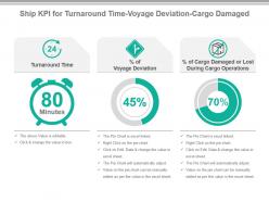 Ship kpi for turnaround time voyage deviation cargo damaged presentation slide
Presenting ship kpi for turnaround time voyage deviation cargo damaged presentation slide. This presentation slide shows three Key Performance Indicators or KPIs in a Dashboard style design. The first KPI that can be shown is Turnaround Time. The second KPI is percentage of Voyage Deviation and the third is percentage of Cargo Damaged or Lost During Cargo Operations. These KPI Powerpoint graphics are all data driven, and the shape automatically adjusts according to your data. Just right click on the KPI graphic, enter the right value and the shape will adjust automatically. Make a visual impact with our KPI slides.
-
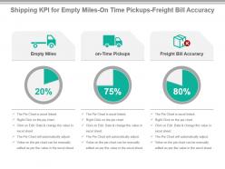 Shipping kpi for empty miles on time pickups freight bill accuracy powerpoint slide
Presenting shipping kpi for empty miles on time pickups freight bill accuracy powerpoint slide. This presentation slide shows three Key Performance Indicators or KPIs in a Dashboard style design. The first KPI that can be shown is Empty Miles. The second KPI is on Time Pickups and the third is Freight Bill Accuracy. These KPI Powerpoint graphics are all data driven, and the shape automatically adjusts according to your data. Just right click on the KPI graphic, enter the right value and the shape will adjust automatically. Make a visual impact with our KPI slides.
-
 Shipping kpi for maintenance costs time frequency of docking ppt slide
Presenting shipping kpi for maintenance costs time frequency of docking ppt slide. This presentation slide shows three Key Performance Indicators or KPIs in a Dashboard style design. The first KPI that can be shown is Average Maintenance Costs Per Ship. The second KPI is Average Maintenance Time Per Ship and the third is Frequency of Docking. These KPI Powerpoint graphics are all data driven, and the shape automatically adjusts according to your data. Just right click on the KPI graphic, enter the right value and the shape will adjust automatically. Make a visual impact with our KPI slides.
-
 Shipping kpi for variable employee non employee costs per ship presentation slide
Presenting shipping kpi for variable employee non employee costs per ship presentation slide. This presentation slide shows three Key Performance Indicators or KPIs in a Dashboard style design. The first KPI that can be shown is Average Variable Costs Per Ship. The second KPI is Average Employee Costs Per Ship and the third is Average Non Employee Costs Per Ship. These KPI Powerpoint graphics are all data driven, and the shape automatically adjusts according to your data. Just right click on the KPI graphic, enter the right value and the shape will adjust automatically. Make a visual impact with our KPI slides.
-
 Transportation kpi for co2e nox emissions vehicle productivity powerpoint slide
Presenting transportation kpi for co2e nox emissions vehicle productivity powerpoint slide. This presentation slide shows three Key Performance Indicators or KPIs in a Dashboard style design. The first KPI that can be shown is CO2e Emissions Per 1000 Revenue Ton Miles. The second KPI is Nox Emissions Per 1000 Revenue Ton Miles and the third is Vehicle Productivity. These KPI Powerpoint graphics are all data driven, and the shape automatically adjusts according to your data. Just right click on the KPI graphic, enter the right value and the shape will adjust automatically. Make a visual impact with our KPI slides.
-
 Transportation kpi for damaged orders on time delivery freight cost ppt slide
Presenting transportation kpi for damaged orders on time delivery freight cost ppt slide. This presentation slide shows three Key Performance Indicators or KPIs in a Dashboard style design. The first KPI that can be shown is percentage of Orders Delivered With Damaged Products Items. The second KPI is on Time Delivery and Pickup Load, Stop and Shipment and the third is Freight Cost Per Unit Shipped. These KPI Powerpoint graphics are all data driven, and the shape automatically adjusts according to your data. Just right click on the KPI graphic, enter the right value and the shape will adjust automatically. Make a visual impact with our KPI slides.
-
 Kpi for international delivery non deliverables items per delivery powerpoint slide
Presenting kpi for international delivery non deliverables items per delivery powerpoint slide. This presentation slide shows Three Key Performance Indicators or KPIs in a Dashboard style design. The first KPI that can be shown is Average Time to Deliver Internationally. The second KPI is Number of Deliveries That are Not Delivered Per 100000 Deliveries. The third is Average Number of Items Per Delivery. These KPI Powerpoint graphics are all data driven, and the shape automatically adjusts according to your data. Just right click on the KPI graphic, enter the right value and the shape will adjust automatically. Make a visual impact with our KPI slides.
-
 Kpi for national airspace system delays cargo throughput block hours ppt slide
Presenting kpi for national airspace system delays cargo throughput block hours ppt slide. This presentation slide shows Three Key Performance Indicators or KPIs in a Dashboard style design. The first KPI that can be shown is Percentage of National Airspace System Delays. The second KPI is Cargo Throughput. The third is Block Hours. These KPI Powerpoint graphics are all data driven, and the shape automatically adjusts according to your data. Just right click on the KPI graphic, enter the right value and the shape will adjust automatically. Make a visual impact with our KPI slides.
-
 Kpi for national airspace system delays received landing and take off fees presentation slide
Presenting kpi for national airspace system delays received landing and take off fees presentation slide. This presentation slide shows Two Key Performance Indicators or KPIs in a Dashboard style design. The first KPI that can be shown is Percentage of National Airspace System Delays. The second KPI is Total Received Landing and Take off Fees. These KPI Powerpoint graphics are all data driven, and the shape automatically adjusts according to your data. Just right click on the KPI graphic, enter the right value and the shape will adjust automatically. Make a visual impact with our KPI slides.
-
 Kpi for national deliveries profit per international national delivery powerpoint slide
Presenting kpi for national deliveries profit per international national delivery powerpoint slide. This presentation slide shows Three Key Performance Indicators or KPIs in a Dashboard style design. The first KPI that can be shown is Number of Employees Per 100000 National Deliveries. The second KPI is Profit Per International Delivery. The third is Profit Per National Delivery. These KPI Powerpoint graphics are all data driven, and the shape automatically adjusts according to your data. Just right click on the KPI graphic, enter the right value and the shape will adjust automatically. Make a visual impact with our KPI slides.
-
 Kpi for noise level infringements cost per aircraft movement check in time ppt slide
Presenting kpi for noise level infringements cost per aircraft movement check in time ppt slide. This presentation slide shows Three Key Performance Indicators or KPIs in a Dashboard style design. The first KPI that can be shown is Number of Noise Level Infringements as Percentage of Flight Movements. The second KPI is Cost Per Aircraft Movement. The third is Average Check in Time. These KPI Powerpoint graphics are all data driven, and the shape automatically adjusts according to your data. Just right click on the KPI graphic, enter the right value and the shape will adjust automatically. Make a visual impact with our KPI slides.
-
 Kpi for nox emissions per 1000 miles total costs fixed costs per truck presentation slide
Presenting kpi for nox emissions per 1000 miles total costs fixed costs per truck presentation slide. This presentation slide shows Three Key Performance Indicators or KPIs in a Dashboard style design. The first KPI that can be shown is Nox Emissions Per 1000 Revenue Ton Miles. The second KPI is Average Total Costs Per Truck. The third is Average Fixed Costs Per Truck. These KPI Powerpoint graphics are all data driven, and the shape automatically adjusts according to your data. Just right click on the KPI graphic, enter the right value and the shape will adjust automatically. Make a visual impact with our KPI slides.
-
 Kpi for number of flight hours per hour revenue per seat e tickets powerpoint slide
Presenting kpi for number of flight hours per hour revenue per seat e tickets powerpoint slide. This presentation slide shows Three Key Performance Indicators or KPIs in a Dashboard style design. The first KPI that can be shown is Average Number of Flight Hours Per Crew Member. The second KPI is Percentage Revenue Per Available Seat. The third is Percentage of e Tickets. These KPI Powerpoint graphics are all data driven, and the shape automatically adjusts according to your data. Just right click on the KPI graphic, enter the right value and the shape will adjust automatically. Make a visual impact with our KPI slides.
-
 Kpi for on time reliability ratio fixed versus variable direct indirect costs ppt slide
Presenting kpi for on time reliability ratio fixed versus variable direct indirect costs ppt slide. This presentation slide shows Three Key Performance Indicators or KPIs in a Dashboard style design. The first KPI that can be shown is on Time Reliability Percentage. The second KPI is Ratio Fixed Versus Variable Costs Per Train. The third is Ratio Direct Versus Indirect Costs Per Train. These KPI Powerpoint graphics are all data driven, and the shape automatically adjusts according to your data. Just right click on the KPI graphic, enter the right value and the shape will adjust automatically. Make a visual impact with our KPI slides.
-
 Kpi for passenger volume total costs average costs per airplane presentation slide
Presenting kpi for passenger volume total costs average costs per airplane presentation slide. This presentation slide shows Three Key Performance Indicators or KPIs in a Dashboard style design. The first KPI that can be shown is Passenger Volume. The second KPI is Average Total Costs Per Airplane. The third is Average Fixed Costs Per Airplane. These KPI Powerpoint graphics are all data driven, and the shape automatically adjusts according to your data. Just right click on the KPI graphic, enter the right value and the shape will adjust automatically. Make a visual impact with our KPI slides.
-
 Kpi for preventive corrective maintenance time co2e emissions powerpoint slide
Presenting kpi for preventive corrective maintenance time co2e emissions powerpoint slide. This presentation slide shows Three Key Performance Indicators or KPIs in a Dashboard style design. The first KPI that can be shown is Average Preventive Maintenance Time Per Truck. The second KPI is Ratio Corrective Versus Preventive Maintenance Time Per Truck. The third is CO2e Emissions Per 1000 Revenue Ton Miles. These KPI Powerpoint graphics are all data driven, and the shape automatically adjusts according to your data. Just right click on the KPI graphic, enter the right value and the shape will adjust automatically. Make a visual impact with our KPI slides.
-
 Kpi for ratio corrective and preventive maintenance dwell time train speed ppt slide
Presenting kpi for ratio corrective and preventive maintenance dwell time train speed ppt slide. This presentation slide shows Three Key Performance Indicators or KPIs in a Dashboard style design. The first KPI that can be shown is Ratio Corrective Versus Preventive Maintenance Costs Per Train. The second KPI is Dwell Time as Percentage of Transit Time. The third is AVG Train Speed. These KPI Powerpoint graphics are all data driven, and the shape automatically adjusts according to your data. Just right click on the KPI graphic, enter the right value and the shape will adjust automatically. Make a visual impact with our KPI slides.
-
 Kpi for ratio cost profit of international and national delivery presentation slide
Presenting kpi for ratio cost profit of international and national delivery presentation slide. This presentation slide shows Three Key Performance Indicators or KPIs in a Dashboard style design. The first KPI that can be shown is Ratio Cost of International Versus National Delivery. The second KPI is Ratio Profit of International Versus National Delivery. The third is Number of Deliveries That are Not Delivered Correctly First Time Per 100000 Deliveries. These KPI Powerpoint graphics are all data driven, and the shape automatically adjusts according to your data. Just right click on the KPI graphic, enter the right value and the shape will adjust automatically. Make a visual impact with our KPI slides.
-
 Kpi for ratio employee non employee costs corrective preventive maintenance time powerpoint slide
Presenting kpi for ratio employee non employee costs corrective preventive maintenance time powerpoint slide. This presentation slide shows Three Key Performance Indicators or KPIs in a Dashboard style design. The first KPI that can be shown is Ratio Employee Costs Versus Non Employee Costs Per Train. The second KPI is Average Corrective Maintenance Time Per Train. The third is Average Preventive Maintenance Time Per Train. These KPI Powerpoint graphics are all data driven, and the shape automatically adjusts according to your data. Just right click on the KPI graphic, enter the right value and the shape will adjust automatically. Make a visual impact with our KPI slides.
-
Topic best represented with attractive design.
-
Use of different colors is good. It's simple and attractive.
-
Great product with effective design. Helped a lot in our corporate presentations. Easy to edit and stunning visuals.
-
Very unique and reliable designs.
-
Unique and attractive product design.
-
Excellent template with unique design.
-
Great product with highly impressive and engaging designs.
-
Nice and innovative design.
-
Graphics are very appealing to eyes.
-
Great designs, really helpful.


