Powerpoint Templates and Google slides for Time.
Save Your Time and attract your audience with our fully editable PPT Templates and Slides.
-
 Update time between automated and manual measurement kpis data collection sources presentation slide
Presenting update time between automated and manual measurement kpis data collection sources presentation slide. This presentation slide shows three Key Performance Indicators or KPIs in a Dashboard style design. The first KPI that can be shown is Average Time Between Updates of KPIs with Automated Measurement. The second KPI is Average Time Between Updates of KPIs with Manual Measurement and the third is Number of Sources used for Data Collection. These KPI Powerpoint graphics are all data driven, and the shape automatically adjusts according to your data. Just right click on the KPI graphic, enter the right value and the shape will adjust automatically. Make a visual impact with our KPI slides.
-
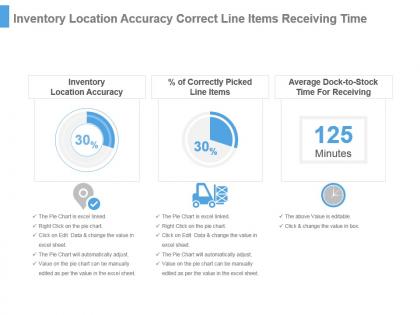 Inventory location accuracy correct line items receiving time ppt slide
Presenting inventory location accuracy correct line items receiving time ppt slide. This presentation slide shows Three Key Performance Indicators or KPIs in a Dashboard style design. The first KPI that can be shown is Inventory Location Accuracy. The second KPI is Percentage of Correctly Picked Line Items. The third is Average Dock to Stock Time For Receiving. These KPI Powerpoint graphics are all data driven, and the shape automatically adjusts according to your data. Just right click on the KPI graphic, enter the right value and the shape will adjust automatically. Make a visual impact with our KPI slides.
-
 Warehouse kpi for completed correct orders inspection time ppt slide
Presenting warehouse kpi for completed correct orders inspection time ppt slide. This presentation slide shows Three Key Performance Indicators or KPIs in a Dashboard style design. The first KPI that can be shown is Box Order Completeness. The second KPI is Box Order Correctness. The third is Average Dock to Stock Time For Inspection Testing. These KPI Powerpoint graphics are all data driven, and the shape automatically adjusts according to your data. Just right click on the KPI graphic, enter the right value and the shape will adjust automatically. Make a visual impact with our KPI slides.
-
 Kpi for load fulfilment empty miles stock time inspection ppt slide
Presenting kpi for load fulfilment empty miles stock time inspection ppt slide. This presentation slide shows Three Key Performance Indicators or KPIs in a Dashboard style design. The first KPI that can be shown is Optimize Load Fulfilment or OLF Percentage. The second KPI is Empty Miles. The third is Average Dock to Stock Time for Inspection Testing. These KPI Powerpoint graphics are all data driven, and the shape automatically adjusts according to your data. Just right click on the KPI graphic, enter the right value and the shape will adjust automatically. Make a visual impact with our KPI slides.
-
 Kpi for rfid items equipped tracked time handling ppt slide
Presenting kpi for rfid items equipped tracked time handling ppt slide. This presentation slide shows Three Key Performance Indicators or KPIs in a Dashboard style design. The first KPI that can be shown is Percentage of Items Equipped With Radio Frequency Identification or RFID. The second KPI is Percentage of Items Tracked With Radio Frequency Identification or RFID. The third is Average Dock to Stock Time For Handling. These KPI Powerpoint graphics are all data driven, and the shape automatically adjusts according to your data. Just right click on the KPI graphic, enter the right value and the shape will adjust automatically. Make a visual impact with our KPI slides.
-
 Kpi for stock receiving time logistics costs presentation slide
Presenting kpi for stock receiving time logistics costs presentation slide. This presentation slide shows Two Key Performance Indicators or KPIs in a Dashboard style design. The first KPI that can be shown is Average Dock to Stock Time for Receiving. The second KPI is Total Logistics Costs as a Percentage of Sales. These KPI Powerpoint graphics are all data driven, and the shape automatically adjusts according to your data. Just right click on the KPI graphic, enter the right value and the shape will adjust automatically. Make a visual impact with our KPI slides.
-
 Supply chain kpi for cycle cash time on time ship rate fill rate powerpoint slide
Presenting supply chain kpi for cycle cash time on time ship rate fill rate powerpoint slide. This presentation slide shows three Key Performance Indicators or KPIs in a Dashboard style design. The first KPI that can be shown is Cash To Cash Cycle Time. The second KPI is On Time Ship Rate and the third is Fill Rate. These KPI Powerpoint graphics are all data driven, and the shape automatically adjusts according to your data. Just right click on the KPI graphic, enter the right value and the shape will adjust automatically. Make a visual impact with our KPI slides.
-
 Supply chain kpi for lead time items equipped items tracked presentation slide
Presenting supply chain kpi for lead time items equipped items tracked presentation slide. This presentation slide shows three Key Performance Indicators or KPIs in a Dashboard style design. The first KPI that can be shown is Percent Variability in Lead Time. The second KPI is percentage of Items Equipped With Radio Frequency Identification or RFID and the third is percentage of Items Tracked With Radio Frequency Identification or RFID. These KPI Powerpoint graphics are all data driven, and the shape automatically adjusts according to your data. Just right click on the KPI graphic, enter the right value and the shape will adjust automatically. Make a visual impact with our KPI slides.
-
 Supply chain kpi for safety stock backorders order cycle time presentation slide
Presenting supply chain kpi for safety stock backorders order cycle time presentation slide. This presentation slide shows three Key Performance Indicators or KPIs in a Dashboard style design. The first KPI that can be shown is Size of Safety Stock. The second KPI is percentage of Backorders and the third is Customer Order Cycle Time. These KPI Powerpoint graphics are all data driven, and the shape automatically adjusts according to your data. Just right click on the KPI graphic, enter the right value and the shape will adjust automatically. Make a visual impact with our KPI slides.
-
 E metrics kpi for average user website time conversion rate powerpoint slide
Presenting e metrics kpi for average user website time conversion rate powerpoint slide. This presentation slide shows two Key Performance Indicators or KPIs in a Dashboard style design. The first KPI that can be shown is Average Time on Website. The second KPI is Conversion Rate. These KPI Powerpoint graphics are all data driven, and the shape automatically adjusts according to your data. Just right click on the KPI graphic, enter the right value and the shape will adjust automatically. Make a visual impact with our KPI slides.
-
 Kpi for user share direct url access last member login time powerpoint slide
Presenting kpi for user share direct url access last member login time powerpoint slide. This presentation slide shows three Key Performance Indicators or KPIs in a Dashboard style design. The first KPI that can be shown is Heavy User Share. The second KPI is of Direct URL Access and the third is Average Time Since Last Member Login. These KPI Powerpoint graphics are all data driven, and the shape automatically adjusts according to your data. Just right click on the KPI graphic, enter the right value and the shape will adjust automatically. Make a visual impact with our KPI slides.
-
 Site analysis kpi for referral rss subscribers members website spent time ppt slide
Presenting site analysis kpi for referral rss subscribers members website spent time ppt slide. This presentation slide shows three Key Performance Indicators or KPIs in a Dashboard style design. The first KPI that can be shown is Referral Percentage. The second KPI is Number of RSS Subscribers and the third is Total Time Spent on Web Site By Members. These KPI Powerpoint graphics are all data driven, and the shape automatically adjusts according to your data. Just right click on the KPI graphic, enter the right value and the shape will adjust automatically. Make a visual impact with our KPI slides.
-
 Site review kpi for non active members page request 404 page time powerpoint slide
Presenting site review kpi for non active members page request 404 page time powerpoint slide. This presentation slide shows two Key Performance Indicators or KPIs in a Dashboard style design. The first KPI that can be shown is Checkouts Per Cart. The second KPI is Anonymous Visitors to Members Conversion Rate. These KPI Powerpoint graphics are all data driven, and the shape automatically adjusts according to your data. Just right click on the KPI graphic, enter the right value and the shape will adjust automatically. Make a visual impact with our KPI slides.
-
 Carrying kpi for agreed delivery time free orders cost fuel per package presentation slide
Presenting carrying kpi for agreed delivery time free orders cost fuel per package presentation slide. This presentation slide shows three Key Performance Indicators or KPIs in a Dashboard style design. The first KPI that can be shown is percentage of Agreed Delivery Times Reached. The second KPI is percentage of Free Orders Delivered Cost and the third is Amount of Fuel Per Package. These KPI Powerpoint graphics are all data driven, and the shape automatically adjusts according to your data. Just right click on the KPI graphic, enter the right value and the shape will adjust automatically. Make a visual impact with our KPI slides.
-
 Freight kpi for net tonne kilometer shipment lead time accuracy powerpoint slide
Presenting freight kpi for net tonne kilometer shipment lead time accuracy powerpoint slide. This presentation slide shows two Key Performance Indicators or KPIs in a Dashboard style design. The first KPI that can be shown is Net Tonne Kilometer NTKM. The second KPI is Shipment Lead Time Accuracy. These KPI Powerpoint graphics are all data driven, and the shape automatically adjusts according to your data. Just right click on the KPI graphic, enter the right value and the shape will adjust automatically. Make a visual impact with our KPI slides.
-
 Kpi for ship maintenance time injured passengers handling operations powerpoint slide
Presenting kpi for ship maintenance time injured passengers handling operations powerpoint slide. This presentation slide shows two Key Performance Indicators or KPIs in a Dashboard style design. The first KPI that can be shown is Time of Ship Maintenance Vs Charter Time. The second KPI is percentage of Injured Passengers During Passenger Handling Operations. These KPI Powerpoint graphics are all data driven, and the shape automatically adjusts according to your data. Just right click on the KPI graphic, enter the right value and the shape will adjust automatically. Make a visual impact with our KPI slides.
-
 Kpi for transit time quantity per shipment vehicle time utilization presentation slide
Presenting kpi for transit time quantity per shipment vehicle time utilization presentation slide. This presentation slide shows three Key Performance Indicators or KPIs in a Dashboard style design. The first KPI that can be shown is Transit Time. The second KPI is Quantity Per Shipment and the third is Vehicle Time Utilization. These KPI Powerpoint graphics are all data driven, and the shape automatically adjusts according to your data. Just right click on the KPI graphic, enter the right value and the shape will adjust automatically. Make a visual impact with our KPI slides.
-
 Ship kpi for average corrective preventive maintenance time powerpoint slide
Presenting ship kpi for average corrective preventive maintenance time powerpoint slide. This presentation slide shows three Key Performance Indicators or KPIs in a Dashboard style design. The first KPI that can be shown is Average Corrective Maintenance Time Per Ship. The second KPI is Average Preventive Maintenance Time Per Ship and the third is Ratio Corrective Versus Preventive Maintenance Time Per Ship. These KPI Powerpoint graphics are all data driven, and the shape automatically adjusts according to your data. Just right click on the KPI graphic, enter the right value and the shape will adjust automatically. Make a visual impact with our KPI slides.
-
 Ship kpi for turnaround time voyage deviation cargo damaged presentation slide
Presenting ship kpi for turnaround time voyage deviation cargo damaged presentation slide. This presentation slide shows three Key Performance Indicators or KPIs in a Dashboard style design. The first KPI that can be shown is Turnaround Time. The second KPI is percentage of Voyage Deviation and the third is percentage of Cargo Damaged or Lost During Cargo Operations. These KPI Powerpoint graphics are all data driven, and the shape automatically adjusts according to your data. Just right click on the KPI graphic, enter the right value and the shape will adjust automatically. Make a visual impact with our KPI slides.
-
 Shipping kpi for empty miles on time pickups freight bill accuracy powerpoint slide
Presenting shipping kpi for empty miles on time pickups freight bill accuracy powerpoint slide. This presentation slide shows three Key Performance Indicators or KPIs in a Dashboard style design. The first KPI that can be shown is Empty Miles. The second KPI is on Time Pickups and the third is Freight Bill Accuracy. These KPI Powerpoint graphics are all data driven, and the shape automatically adjusts according to your data. Just right click on the KPI graphic, enter the right value and the shape will adjust automatically. Make a visual impact with our KPI slides.
-
 Shipping kpi for maintenance costs time frequency of docking ppt slide
Presenting shipping kpi for maintenance costs time frequency of docking ppt slide. This presentation slide shows three Key Performance Indicators or KPIs in a Dashboard style design. The first KPI that can be shown is Average Maintenance Costs Per Ship. The second KPI is Average Maintenance Time Per Ship and the third is Frequency of Docking. These KPI Powerpoint graphics are all data driven, and the shape automatically adjusts according to your data. Just right click on the KPI graphic, enter the right value and the shape will adjust automatically. Make a visual impact with our KPI slides.
-
 Transportation kpi for damaged orders on time delivery freight cost ppt slide
Presenting transportation kpi for damaged orders on time delivery freight cost ppt slide. This presentation slide shows three Key Performance Indicators or KPIs in a Dashboard style design. The first KPI that can be shown is percentage of Orders Delivered With Damaged Products Items. The second KPI is on Time Delivery and Pickup Load, Stop and Shipment and the third is Freight Cost Per Unit Shipped. These KPI Powerpoint graphics are all data driven, and the shape automatically adjusts according to your data. Just right click on the KPI graphic, enter the right value and the shape will adjust automatically. Make a visual impact with our KPI slides.
-
 Kpi for noise level infringements cost per aircraft movement check in time ppt slide
Presenting kpi for noise level infringements cost per aircraft movement check in time ppt slide. This presentation slide shows Three Key Performance Indicators or KPIs in a Dashboard style design. The first KPI that can be shown is Number of Noise Level Infringements as Percentage of Flight Movements. The second KPI is Cost Per Aircraft Movement. The third is Average Check in Time. These KPI Powerpoint graphics are all data driven, and the shape automatically adjusts according to your data. Just right click on the KPI graphic, enter the right value and the shape will adjust automatically. Make a visual impact with our KPI slides.
-
 Kpi for on time reliability ratio fixed versus variable direct indirect costs ppt slide
Presenting kpi for on time reliability ratio fixed versus variable direct indirect costs ppt slide. This presentation slide shows Three Key Performance Indicators or KPIs in a Dashboard style design. The first KPI that can be shown is on Time Reliability Percentage. The second KPI is Ratio Fixed Versus Variable Costs Per Train. The third is Ratio Direct Versus Indirect Costs Per Train. These KPI Powerpoint graphics are all data driven, and the shape automatically adjusts according to your data. Just right click on the KPI graphic, enter the right value and the shape will adjust automatically. Make a visual impact with our KPI slides.
-
 Kpi for preventive corrective maintenance time co2e emissions powerpoint slide
Presenting kpi for preventive corrective maintenance time co2e emissions powerpoint slide. This presentation slide shows Three Key Performance Indicators or KPIs in a Dashboard style design. The first KPI that can be shown is Average Preventive Maintenance Time Per Truck. The second KPI is Ratio Corrective Versus Preventive Maintenance Time Per Truck. The third is CO2e Emissions Per 1000 Revenue Ton Miles. These KPI Powerpoint graphics are all data driven, and the shape automatically adjusts according to your data. Just right click on the KPI graphic, enter the right value and the shape will adjust automatically. Make a visual impact with our KPI slides.
-
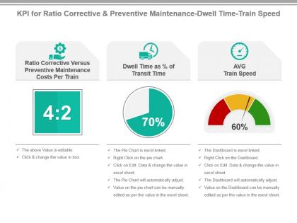 Kpi for ratio corrective and preventive maintenance dwell time train speed ppt slide
Presenting kpi for ratio corrective and preventive maintenance dwell time train speed ppt slide. This presentation slide shows Three Key Performance Indicators or KPIs in a Dashboard style design. The first KPI that can be shown is Ratio Corrective Versus Preventive Maintenance Costs Per Train. The second KPI is Dwell Time as Percentage of Transit Time. The third is AVG Train Speed. These KPI Powerpoint graphics are all data driven, and the shape automatically adjusts according to your data. Just right click on the KPI graphic, enter the right value and the shape will adjust automatically. Make a visual impact with our KPI slides.
-
 Kpi for ratio employee non employee costs corrective preventive maintenance time powerpoint slide
Presenting kpi for ratio employee non employee costs corrective preventive maintenance time powerpoint slide. This presentation slide shows Three Key Performance Indicators or KPIs in a Dashboard style design. The first KPI that can be shown is Ratio Employee Costs Versus Non Employee Costs Per Train. The second KPI is Average Corrective Maintenance Time Per Train. The third is Average Preventive Maintenance Time Per Train. These KPI Powerpoint graphics are all data driven, and the shape automatically adjusts according to your data. Just right click on the KPI graphic, enter the right value and the shape will adjust automatically. Make a visual impact with our KPI slides.
-
 Kpi for security control time flights diverted non aviation activities presentation slide
Presenting KPI For Security Control Time Flights Diverted Non Aviation Activities Presentation Slide. This presentation design has been professionally designed, is fully editable in PowerPoint and is compatible with Google slides as well. The font type, font size, colors of the diagrams, background color are customizable, and the company logo can be added too. High quality graphs, charts, tables and icons ensure that there is no deteriorating in quality on enlarging their size. Fast download at click of a button.
-
 Kpi for turnaround time truckload capacity utilized profit per truck ppt slide
Presenting kpi for turnaround time truckload capacity utilized profit per truck ppt slide. This presentation slide shows Three Key Performance Indicators or KPIs in a Dashboard style design. The first KPI that can be shown is Turnaround Time. The second KPI is Percentage of Truckload Capacity Utilized. The third is Profit Per Truck. These KPI Powerpoint graphics are all data driven, and the shape automatically adjusts according to your data. Just right click on the KPI graphic, enter the right value and the shape will adjust automatically. Make a visual impact with our KPI slides.
-
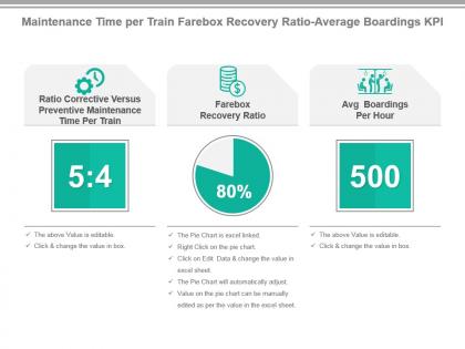 Maintenance time per train farebox recovery ratio average boardings kpi presentation slide
Presenting maintenance time per train farebox recovery ratio average boardings kpi presentation slide. This presentation slide shows Three Key Performance Indicators or KPIs in a Dashboard style design. The first KPI that can be shown is Ratio Corrective Versus Preventive Maintenance Time Per Train. The second KPI is Farebox Recovery Ratio. The third is Avg Boardings Per Hour. These KPI Powerpoint graphics are all data driven, and the shape automatically adjusts according to your data. Just right click on the KPI graphic, enter the right value and the shape will adjust automatically. Make a visual impact with our KPI slides.
-
 Rail kpi for turnaround time ticket prices on time reliability presentation slide
Presenting rail kpi for turnaround time ticket prices on time reliability presentation slide. This presentation slide shows Three Key Performance Indicators or KPIs in a Dashboard style design. The first KPI that can be shown is Turnaround Time. The second KPI is Average Ticket Prices. The third is on Time Reliability Percentage During Peak Times. These KPI Powerpoint graphics are all data driven, and the shape automatically adjusts according to your data. Just right click on the KPI graphic, enter the right value and the shape will adjust automatically. Make a visual impact with our KPI slides.
-
 Ratio fixed average corrective maintenance time variable costs kpi presentation slide
Presenting ratio fixed average corrective maintenance time variable costs kpi presentation slide. This presentation slide shows Three Key Performance Indicators or KPIs in a Dashboard style design. The first KPI that can be shown is Ratio Fixed Versus Variable Costs Per Truck. The second KPI is Average Corrective Maintenance Time Per Truck. The third is Average Variable Costs Per Truck. These KPI Powerpoint graphics are all data driven, and the shape automatically adjusts according to your data. Just right click on the KPI graphic, enter the right value and the shape will adjust automatically. Make a visual impact with our KPI slides.
-
 Airline kpi for corrective preventive maintenance time ratio corrective powerpoint slide
Presenting airline kpi for corrective preventive maintenance time ratio corrective powerpoint slide. This presentation slide shows three Key Performance Indicators or KPIs in a Dashboard style design. The first KPI that can be shown is Average Corrective Maintenance Time Per Airplane. The second KPI is Average Preventive Maintenance Time Per Airplane and the third is Ratio Corrective Versus Preventive Maintenance Time Per Airplane. These KPI Powerpoint graphics are all data driven, and the shape automatically adjusts according to your data. Just right click on the KPI graphic, enter the right value and the shape will adjust automatically. Make a visual impact with our KPI slides.
-
 Airline kpi for turnaround time average ticket prices freight revenue presentation slide
Presenting airline kpi for turnaround time average ticket prices freight revenue presentation slide. This presentation slide shows three Key Performance Indicators or KPIs in a Dashboard style design. The first KPI that can be shown is Turnaround Time. The second KPI is Average Ticket Prices and the third is Average Freight Revenue Per Ton Mile. These KPI Powerpoint graphics are all data driven, and the shape automatically adjusts according to your data. Just right click on the KPI graphic, enter the right value and the shape will adjust automatically. Make a visual impact with our KPI slides.
-
 Carrier kpi for on time departure revenue per seat lost luggage ppt slide
Presenting carrier kpi for on time departure revenue per seat lost luggage ppt slide. This presentation slide shows three Key Performance Indicators or KPIs in a Dashboard style design. The first KPI that can be shown is percentage of on Time Departure of Flights. The second KPI is Revenue Seat Passenger Kilometer RPK and the third is percentage of Lost Bags Luggage. These KPI Powerpoint graphics are all data driven, and the shape automatically adjusts according to your data. Just right click on the KPI graphic, enter the right value and the shape will adjust automatically. Make a visual impact with our KPI slides.
-
 Flight kpi for voyage deviation time utilization cancelled requests powerpoint slide
Presenting flight kpi for voyage deviation time utilization cancelled requests powerpoint slide. This presentation slide shows three Key Performance Indicators or KPIs in a Dashboard style design. The first KPI that can be shown is percentage of Voyage Deviation. The second KPI is Vehicle Time Utilization and the third is percentages of Cancelled Reservation Requests. These KPI Powerpoint graphics are all data driven, and the shape automatically adjusts according to your data. Just right click on the KPI graphic, enter the right value and the shape will adjust automatically. Make a visual impact with our KPI slides.
-
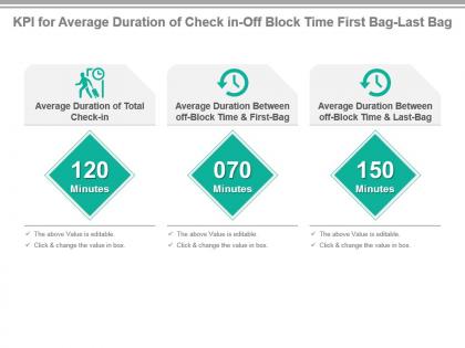 Kpi for average duration of check in off block time first bag last bag presentation slide
Presenting kpi for average duration of check in off block time first bag last bag presentation slide. This presentation slide shows three Key Performance Indicators or KPIs in a Dashboard style design. The first KPI that can be shown is Average Duration of Total Check in. The second KPI is Average Duration Between off Block Time And First Bag and the third is Average Duration Between off Block Time And Last Bag. These KPI Powerpoint graphics are all data driven, and the shape automatically adjusts according to your data. Just right click on the KPI graphic, enter the right value and the shape will adjust automatically. Make a visual impact with our KPI slides.
-
 Kpi for average immigration time weather delays check in counters powerpoint slide
Presenting kpi for average immigration time weather delays check in counters powerpoint slide. This presentation slide shows three Key Performance Indicators or KPIs in a Dashboard style design. The first KPI that can be shown is Average Immigration Time. The second KPI is Average Number of Weather Delays and the third is Average Number of Check in Counters Per Flight. These KPI Powerpoint graphics are all data driven, and the shape automatically adjusts according to your data. Just right click on the KPI graphic, enter the right value and the shape will adjust automatically. Make a visual impact with our KPI slides.
-
 Kpi for average maintenance costs maintenance time per truck ppt slide
Presenting kpi for average maintenance costs maintenance time per truck ppt slide. This presentation slide shows two Key Performance Indicators or KPIs in a Dashboard style design. The first KPI that can be shown is Average Maintenance Costs Per Truck. The second KPI is Average Maintenance Time Per Truck. These KPI Powerpoint graphics are all data driven, and the shape automatically adjusts according to your data. Just right click on the KPI graphic, enter the right value and the shape will adjust automatically. Make a visual impact with our KPI slides.
-
 Kpi for average maintenance costs time aircraft emissions presentation slide
Presenting kpi for average maintenance costs time aircraft emissions presentation slide. This presentation slide shows three Key Performance Indicators or KPIs in a Dashboard style design. The first KPI that can be shown is Average Maintenance Costs Per Airplane. The second KPI is Average Maintenance Time Per Airplane and the third is Aircraft Emissions Per Payload Capacity. These KPI Powerpoint graphics are all data driven, and the shape automatically adjusts according to your data. Just right click on the KPI graphic, enter the right value and the shape will adjust automatically. Make a visual impact with our KPI slides.
-
 Kpi for average time to deliver employee costs profit per delivery powerpoint slide
Presenting kpi for average time to deliver employee costs profit per delivery powerpoint slide. This presentation slide shows three Key Performance Indicators or KPIs in a Dashboard style design. The first KPI that can be shown is Average Time to Deliver. The second KPI is Employee Costs Per Delivery and the third is Profit Per Delivery. These KPI Powerpoint graphics are all data driven, and the shape automatically adjusts according to your data. Just right click on the KPI graphic, enter the right value and the shape will adjust automatically. Make a visual impact with our KPI slides.
-
 Kpi for patient cost nosocomial infection hospital beds cycle time powerpoint slide
Presenting kpi for patient cost nosocomial infection hospital beds cycle time powerpoint slide. This presentation slide shows three Key Performance Indicators or KPIs in a Dashboard style design. The first KPI that can be shown is Cost Per Patient Day. The second KPI is percentage of Nosocomial Infection and the third is Average Cycle Time of Hospital Beds. These KPI Powerpoint graphics are all data driven, and the shape automatically adjusts according to your data. Just right click on the KPI graphic, enter the right value and the shape will adjust automatically. Make a visual impact with our KPI slides.
-
 Kpi for profit average employee costs dentist time per treatment powerpoint slide
Presenting kpi for profit average employee costs dentist time per treatment powerpoint slide. This presentation slide shows three Key Performance Indicators or KPIs in a Dashboard style design. The first KPI that can be shown is Profit Per Dentist Treatment. The second KPI is Average Employee Costs Per Dentist Treatment and the third is Average Dentist Time Per Dentist Treatment. These KPI Powerpoint graphics are all data driven, and the shape automatically adjusts according to your data. Just right click on the KPI graphic, enter the right value and the shape will adjust automatically. Make a visual impact with our KPI slides.
-
 Kpi for total time non dentist time x rays to comprehensive dental exams powerpoint slide
Presenting kpi for total time non dentist time x rays to comprehensive dental exams powerpoint slide. This presentation slide shows three Key Performance Indicators or KPIs in a Dashboard style design. The first KPI that can be shown is Average Total Time Per Dentist Treatment. The second KPI is Average Non Dentist Time Per Dentist Treatment and the third is Percentage of X rays to Comprehensive Dental Exams. These KPI Powerpoint graphics are all data driven, and the shape automatically adjusts according to your data. Just right click on the KPI graphic, enter the right value and the shape will adjust automatically. Make a visual impact with our KPI slides.
-
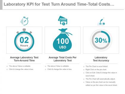 Laboratory kpi for test turn around time total costs test accuracy ppt slide
Presenting laboratory kpi for test turn around time total costs test accuracy ppt slide. This presentation slide shows three Key Performance Indicators or KPIs in a Dashboard style design. The first KPI that can be shown is Average Laboratory Test Turn Around Time. The second KPI is Average Total Costs Per Laboratory Test and the third is Laboratory Test Accuracy. These KPI Powerpoint graphics are all data driven, and the shape automatically adjusts according to your data. Just right click on the KPI graphic, enter the right value and the shape will adjust automatically. Make a visual impact with our KPI slides.
-
 Medical kpi for time spent on patient over email consultation per hour ppt slide
Presenting medical kpi for time spent on patient over email consultation per hour ppt slide. This presentation slide shows two Key Performance Indicators or KPIs in a Dashboard style design. The first KPI that can be shown is percentage of Time Spent on Patient Consultations by Internet email. The second KPI is Average Number of Consultations Per Hour by GP. These KPI Powerpoint graphics are all data driven, and the shape automatically adjusts according to your data. Just right click on the KPI graphic, enter the right value and the shape will adjust automatically. Make a visual impact with our KPI slides.
-
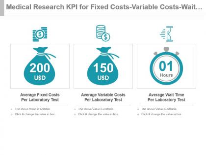 Medical research kpi for fixed costs variable costs wait time per test powerpoint slide
Presenting medical research kpi for fixed costs variable costs wait time per test powerpoint slide. This presentation slide shows three Key Performance Indicators or KPIs in a Dashboard style design. The first KPI that can be shown is Average Fixed Costs Per Laboratory Test. The second KPI is Average Variable Costs Per Laboratory Test and the third is Average Wait Time Per Laboratory Test. These KPI Powerpoint graphics are all data driven, and the shape automatically adjusts according to your data. Just right click on the KPI graphic, enter the right value and the shape will adjust automatically. Make a visual impact with our KPI slides.
-
 Nursing kpi for patient time average nurse per patient total visits presentation slide
Presenting nursing kpi for patient time average nurse per patient total visits presentation slide. This presentation slide shows three Key Performance Indicators or KPIs in a Dashboard style design. The first KPI that can be shown is Total Nurse Patient Facing Time. The second KPI is Average Nurse Patient Facing Time Per Patient and the third is Total Number of Nurse Patient Visits. These KPI Powerpoint graphics are all data driven, and the shape automatically adjusts according to your data. Just right click on the KPI graphic, enter the right value and the shape will adjust automatically. Make a visual impact with our KPI slides.
-
 Practitioner kpi for cost per hour patient consultations time spent powerpoint slide
Presenting practitioner kpi for cost per hour patient consultations time spent powerpoint slide. This presentation slide shows three Key Performance Indicators or KPIs in a Dashboard style design. The first KPI that can be shown is Average Cost Per Hour of Opening of Practice. The second KPI is percentage of Patient Consultations by Telephone and the third is Percentage of Time Spent on Patient Consultations by Telephone. These KPI Powerpoint graphics are all data driven, and the shape automatically adjusts according to your data. Just right click on the KPI graphic, enter the right value and the shape will adjust automatically. Make a visual impact with our KPI slides.
-
 Dentist kpi for average total costs fixed costs occupation time presentation slide
Presenting dentist kpi for average total costs fixed costs occupation time presentation slide. This presentation slide shows three Key Performance Indicators or KPIs in a Dashboard style design. The first KPI that can be shown is Average Total Costs Per Dentist Treatment. The second KPI is Average Fixed Costs Per Dentist Treatment and the third is Dentist Chair Occupation Time percentage. These KPI Powerpoint graphics are all data driven, and the shape automatically adjusts according to your data. Just right click on the KPI graphic, enter the right value and the shape will adjust automatically. Make a visual impact with our KPI slides.
-
 Hospital kpi for average occupation discharge time patient stay time ppt slide
Presenting hospital kpi for average occupation discharge time patient stay time ppt slide. This presentation slide shows three Key Performance Indicators or KPIs in a Dashboard style design. The first KPI that can be shown is Average Occupation Time of Hospital Bed. The second KPI is Average Discharge Time of Patient and the third is Average Length of Stay for Patients. These KPI Powerpoint graphics are all data driven, and the shape automatically adjusts according to your data. Just right click on the KPI graphic, enter the right value and the shape will adjust automatically. Make a visual impact with our KPI slides.
-
 Kpi for average x ray consultation time percentage of emergency x rays presentation slide
Presenting kpi for average x ray consultation time percentage of emergency x rays presentation slide. This presentation slide shows two Key Performance Indicators or KPIs in a Dashboard style design. The first KPI that can be shown is Average Time of X ray Consultation. The second KPI is percentage of Emergency X rays. These KPI Powerpoint graphics are all data driven, and the shape automatically adjusts according to your data. Just right click on the KPI graphic, enter the right value and the shape will adjust automatically. Make a visual impact with our KPI slides.
-
 Kpi for customer order fulfilment with lead time analysis ppt slide
Presenting kpi for customer order fulfilment with lead time analysis ppt slide. This presentation slide shows three Key Performance Indicators or KPIs. The first KPI that can be show is Order Fill Rate, Customer. The second KPI is Order Fulfillment Lead Time and the third is percentage of Orders Requiring Rework. These KPI Powerpoint graphics are all data driven, and the shape automatically adjusts according to your data. Just right click on the KPI graphic, enter the right value and the shape will adjust automatically. Make a visual impact with our KPI slides.
-
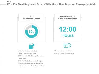 Kpis for total neglected orders with mean time duration powerpoint slide
Presenting kpis for total neglected orders with mean time duration powerpoint slide. This presentation slide shows two Key Performance Indicators or KPIs. The first KPI that can be show is percentage of Re Opened Orders . The second KPI is Mean Duration to Fulfill Service Order. These KPI Powerpoint graphics are all data driven, and the shape automatically adjusts according to your data. Just right click on the KPI graphic, enter the right value and the shape will adjust automatically. Make a visual impact with our KPI slides.
-
 Freight cost kpi for undamaged goods on time pickups powerpoint slide
Presenting freight cost kpi for undamaged goods on time pickups powerpoint slide. This presentation slide shows two Key Performance Indicators or KPIs in a Dashboard style design. The first KPI that can be shown is percentage of Undamaged Goods After Shipping Transportation. The second KPI is On time Pickups. These KPI Powerpoint graphics are all data driven, and the shape automatically adjusts according to your data. Just right click on the KPI graphic, enter the right value and the shape will adjust automatically. Make a visual impact with our KPI slides.
-
 Kpi for transit time shipment quantity damaged throughout presentation slide
Presenting kpi for transit time shipment quantity damaged throughout presentation slide. This presentation slide shows three Key Performance Indicators or KPIs in a Dashboard style design. The first KPI that can be shown is Transit Time. The second KPI is Quantity Per Shipment and the third is Damages as percentage of Throughput. These KPI Powerpoint graphics are all data driven, and the shape automatically adjusts according to your data. Just right click on the KPI graphic, enter the right value and the shape will adjust automatically. Make a visual impact with our KPI slides.
-
 Shipment kpi for transportation cost shipped units lead time ppt slide
Presenting shipment kpi for transportation cost shipped units lead time ppt slide. This presentation slide shows three Key Performance Indicators or KPIs in a Dashboard style design. The first KPI that can be shown is Total Outbound Transportation Cost. The second KPI is Total Number of Outbound Transportation Kilograms and the third is Shipment Lead Time Accuracy. These KPI Powerpoint graphics are all data driven, and the shape automatically adjusts according to your data. Just right click on the KPI graphic, enter the right value and the shape will adjust automatically. Make a visual impact with our KPI slides.
-
 Kpi for inventory replenishment cycle time average unit cost presentation slide
Presenting kpi for inventory replenishment cycle time average unit cost presentation slide. This presentation slide shows two Key Performance Indicators or KPIs in a Dashboard style design. The first KPI that can be shown is Inventory Replenishment Cycle Time. The second KPI is Average Unit Cost. These KPI Powerpoint graphics are all data driven, and the shape automatically adjusts according to your data. Just right click on the KPI graphic, enter the right value and the shape will adjust automatically. Make a visual impact with our KPI slides.
-
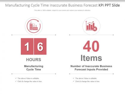 Manufacturing cycle time inaccurate business forecast kpi ppt slide
Presenting manufacturing cycle time inaccurate business forecast kpi ppt slide. This presentation slide shows two Key Performance Indicators or KPIs in a Dashboard style design. The first KPI that can be shown is Manufacturing Cycle Time. The second KPI is Number of Inaccurate Business Forecast Inputs Provided. These KPI Powerpoint graphics are all data driven, and the shape automatically adjusts according to your data. Just right click on the KPI graphic, enter the right value and the shape will adjust automatically. Make a visual impact with our KPI slides.
-
 Percentage value kpi for edi transactions back orders time presentation slide
Presenting percentage value kpi for edi transactions back orders time presentation slide. This presentation slide shows two Key Performance Indicators or KPIs in a Dashboard style design. The first KPI that can be shown is percentage of EDI transactions. The second KPI is percentage of Time Spent Picking Back Orders. These KPI Powerpoint graphics are all data driven, and the shape automatically adjusts according to your data. Just right click on the KPI graphic, enter the right value and the shape will adjust automatically. Make a visual impact with our KPI slides.


